
Have I ever mentioned on here how much I love working with FLOR carpet tiles? I’m sure I have. I used them in my own living room and they’re the best ever. 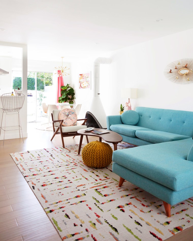
After seeing how easy they are to install and clean, and how durable they are, I knew I wanted to use them somewhere else in my apartment.
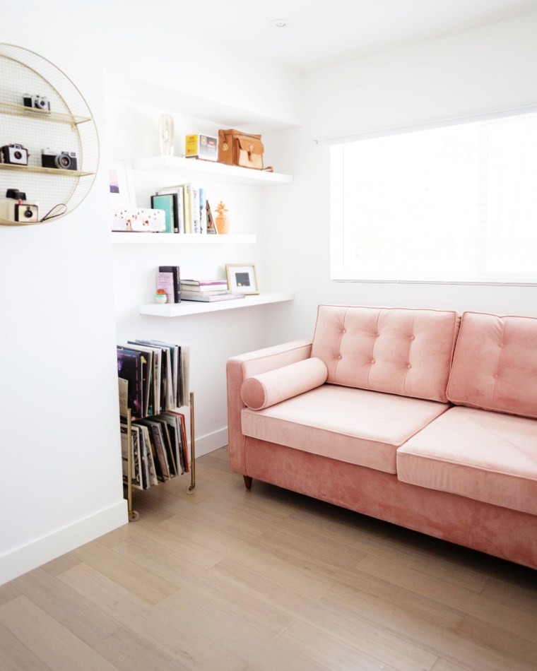
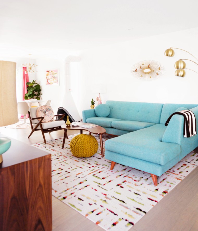
We’re currently in the process of decorating our spare room to be a multi-functional office/guest room. Instead of looking for an area rug to fit the wonky dimensions, I decided to use FLOR carpet squares again. I had the Mod Cafe pattern in mind because I thought the sputnik style design would bring in mid-century hotel and vibes. After receiving samples of all the color variations, I chose the color ‘linen’. It’s a blue-grey that changes to more one or the other depending on how the light hits it.
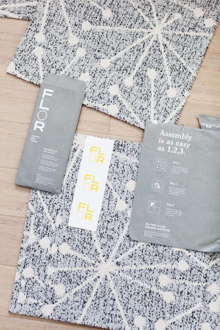 The cool thing about FLOR squares is that you can customize a rug to fit your needs. You can mix and match colors and patterns to create something truly unique, or you can just go with one all over pattern like I’ve done. They’re easy to cut and they simply stick together using the included FLORdots stickers.
 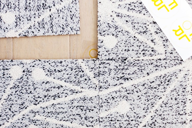 The stickers hold the corners of the tiles together and only stick to the backing of the carpet squares. Nothing actually sticks to your floor underneath so you don’t have to worry about ruining it or having to deal with sticky residue underneath. Plus, when we move we can just stack them up and take them with us to the next place.
OH! They’re also a breeze to clean. Some one spill a drink? Dog had an accident? Just pop up the dirty square and wash it out in the sink. Let it dry and stick it back down. Or if one gets ruined you can replace it.
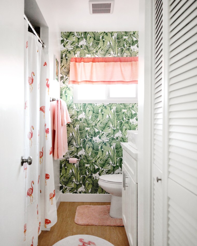
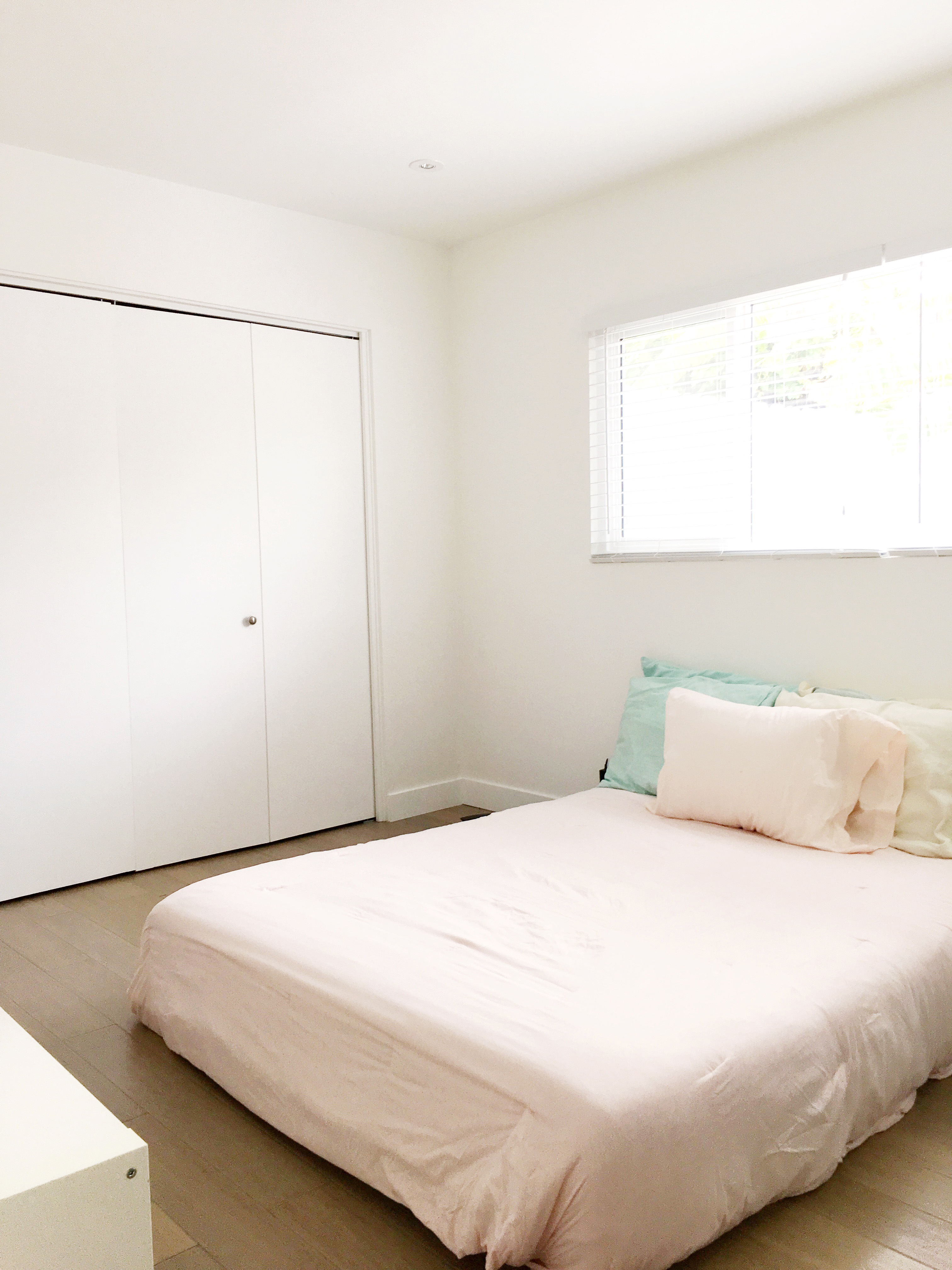
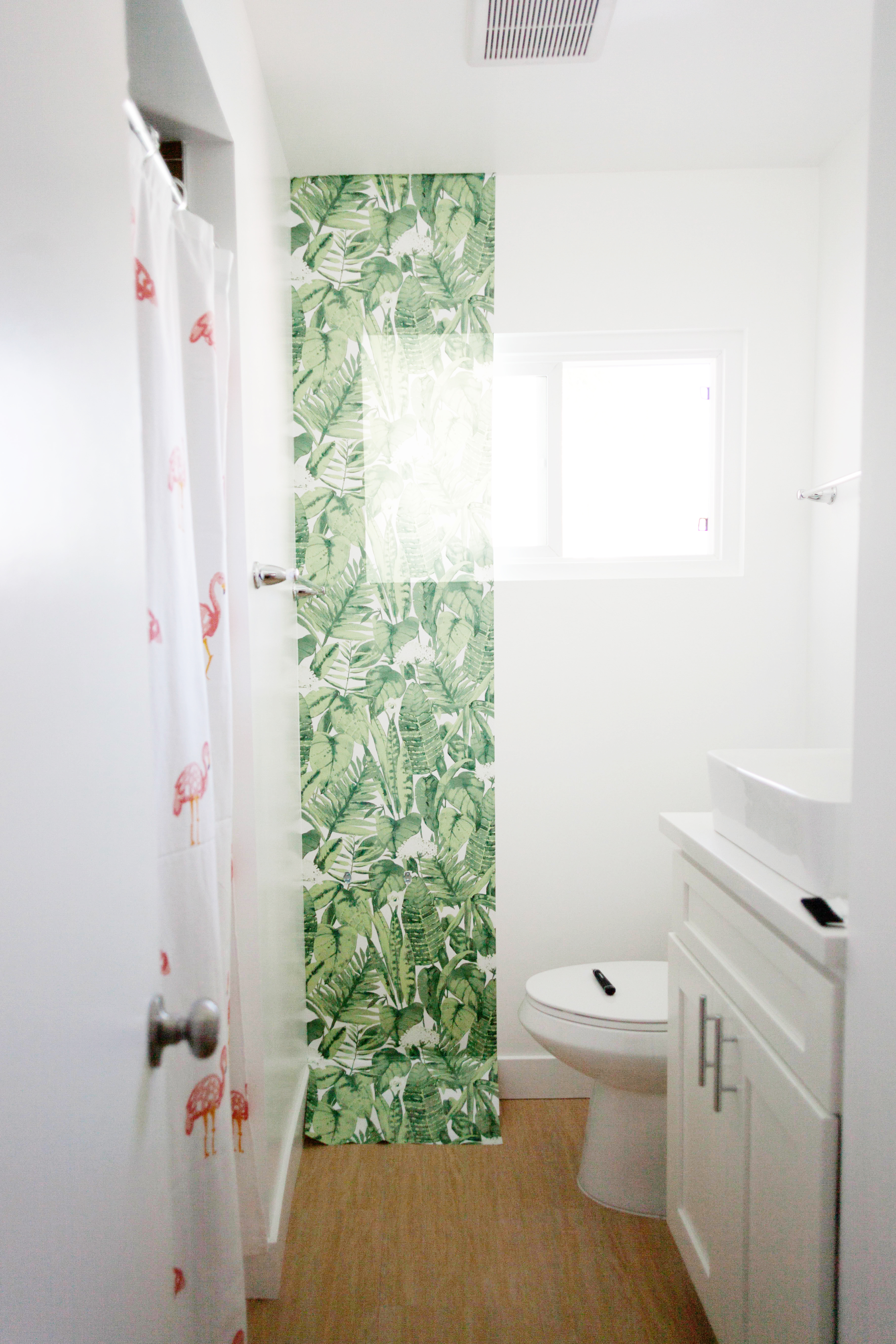
Here’s what the room looked like before FLOR squares.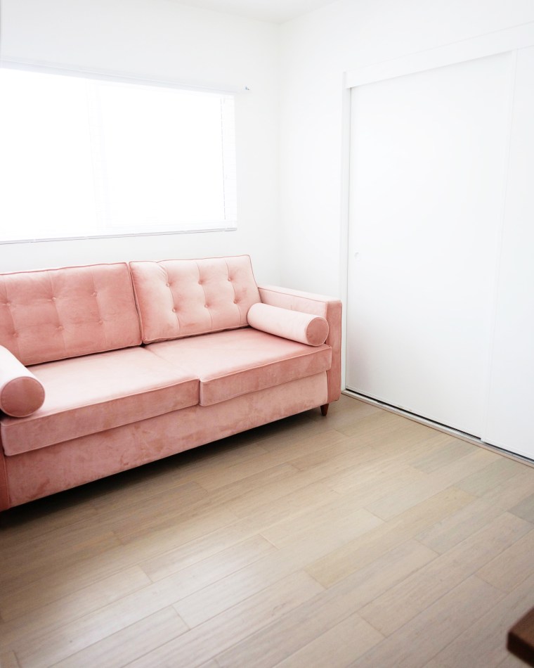
 First I laid out the squares to make sure I was happy with the placement. Any parts that need trimmed are easily cut with a utility knife or box cutter.
 This room is tiny so I decided to do the entire thing. Once I was happy with the placement I easily applied the stickers to the corners to hold it all together and voila!
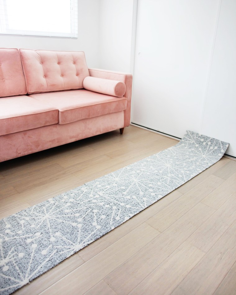
Atomic carpet! All done in about an hour!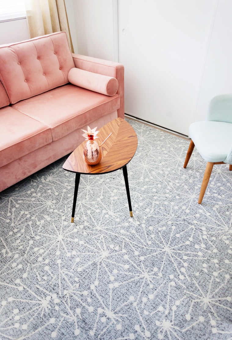
The lines blend together more and more as the carpet fibers fluff up a bit. Vacuuming helps.
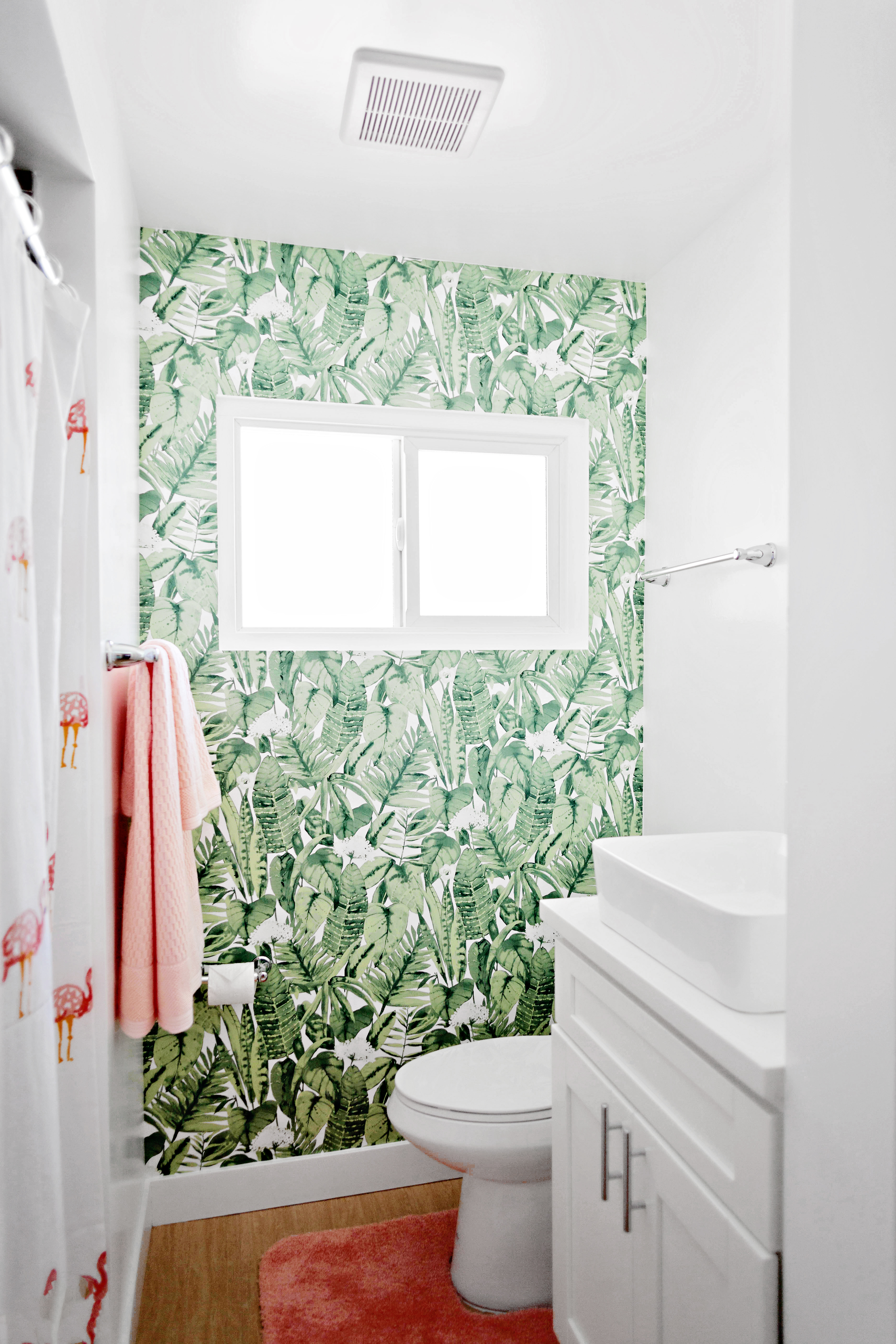
Here’s what it looks like now!
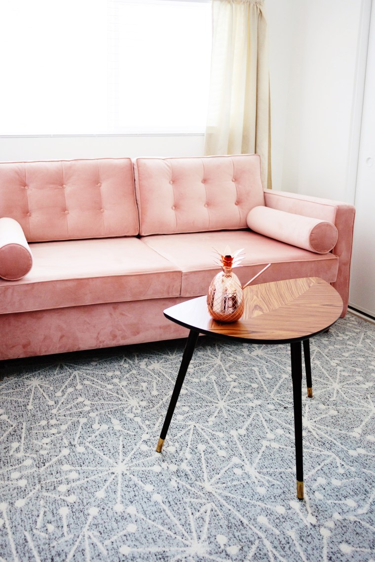
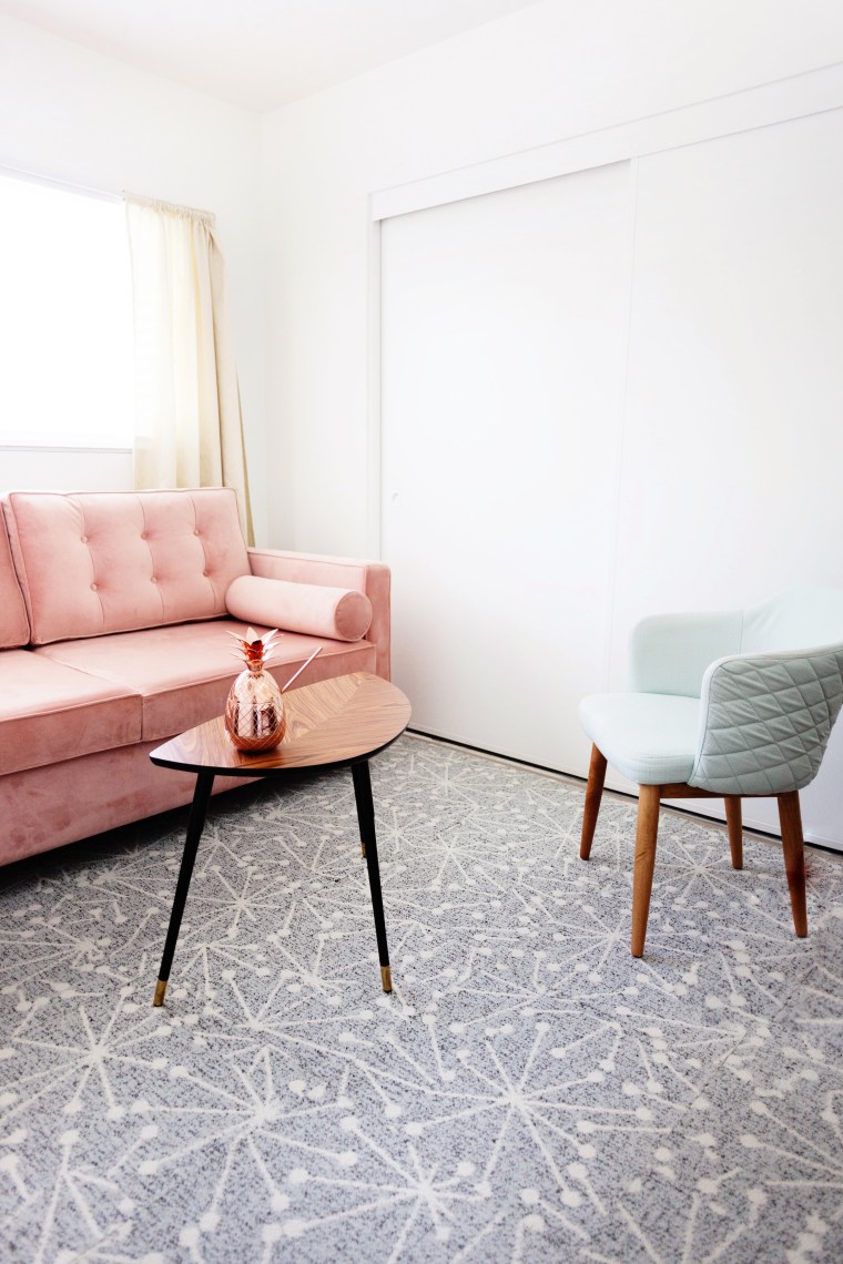 Tada! I think it definitely makes the room feel more put together and adds some much needed pattern. I love the way the blue-grey looks against the blush pink velvet of our sleeper sofa, and the black and gold of the table. Bonus, it’s perfect for home office use because it immediately eliminated any awkward phone echo!
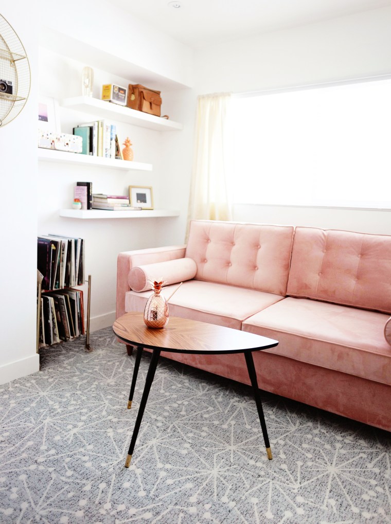
If you’re thinking about getting a little creative with your flooring, be sure to check out FLOR! They always have good sale events and you can purchase in expensive samples of all their patterns before committing.
The room isn’t completely done yet, but stay tuned for a few more DIYs and the final reveal!
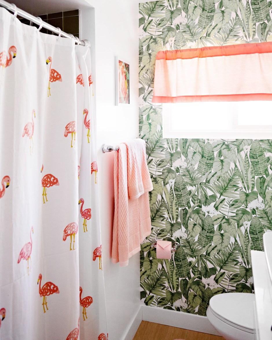
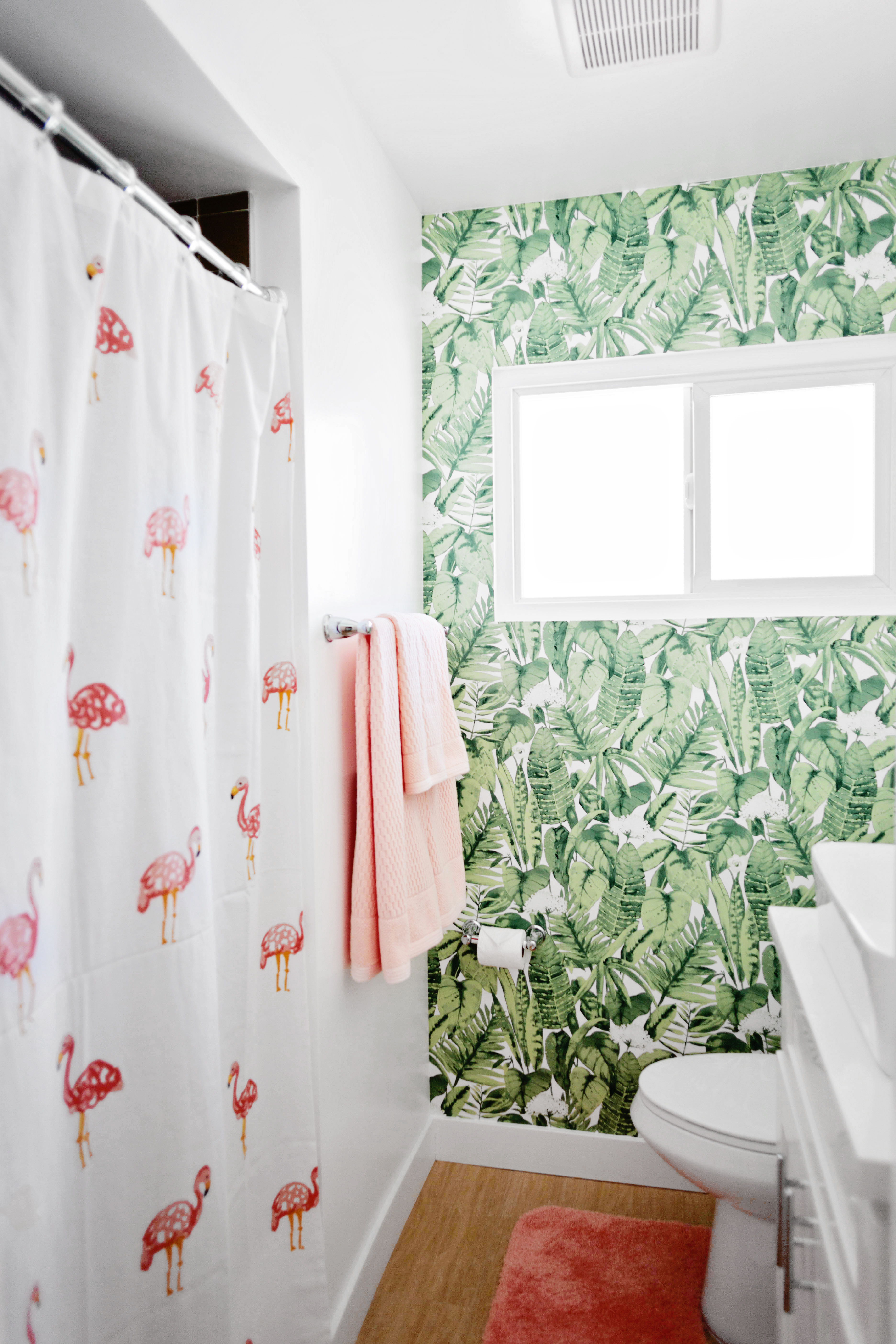
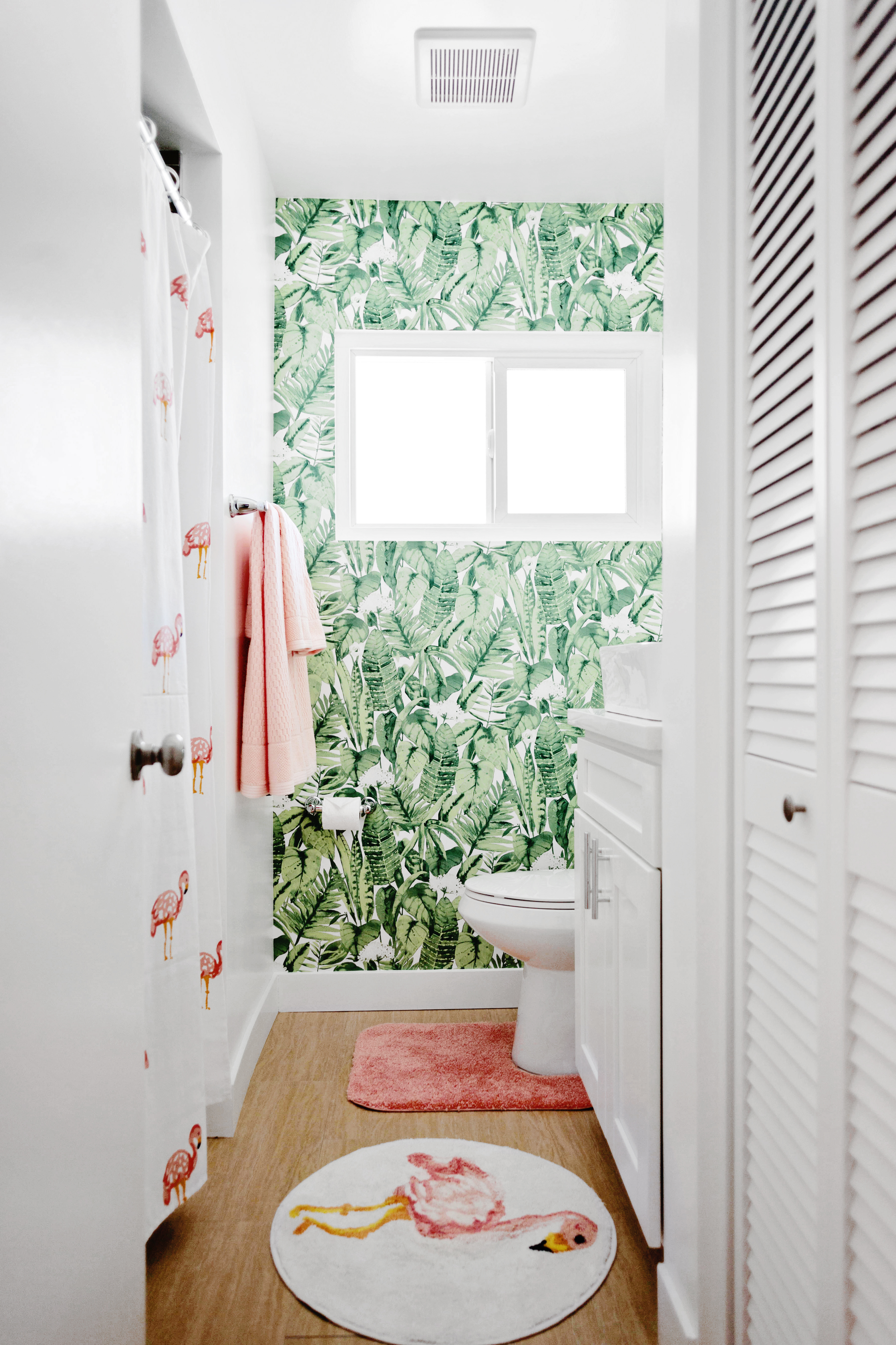
 And here’s the new new!
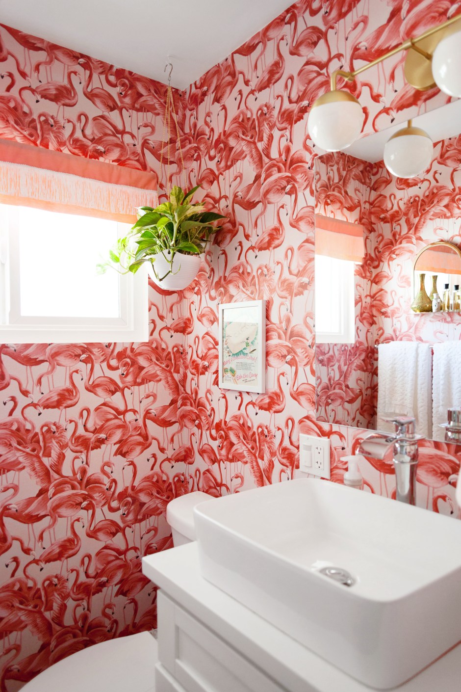
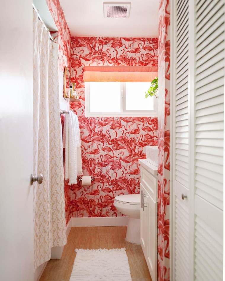 It’s kind of crazy how it makes the room feel bigger. I thought it might feel closed in with so much pattern on the walls, but nope! It works. The print is so lovely. It’s a lovely mix of soft pink and reddish pink that looks amazing against white and gold. As always it was easy to work with and very forgiving. You can refer to my previous post for installation tips that work for me.
  I also added a few new accessories.
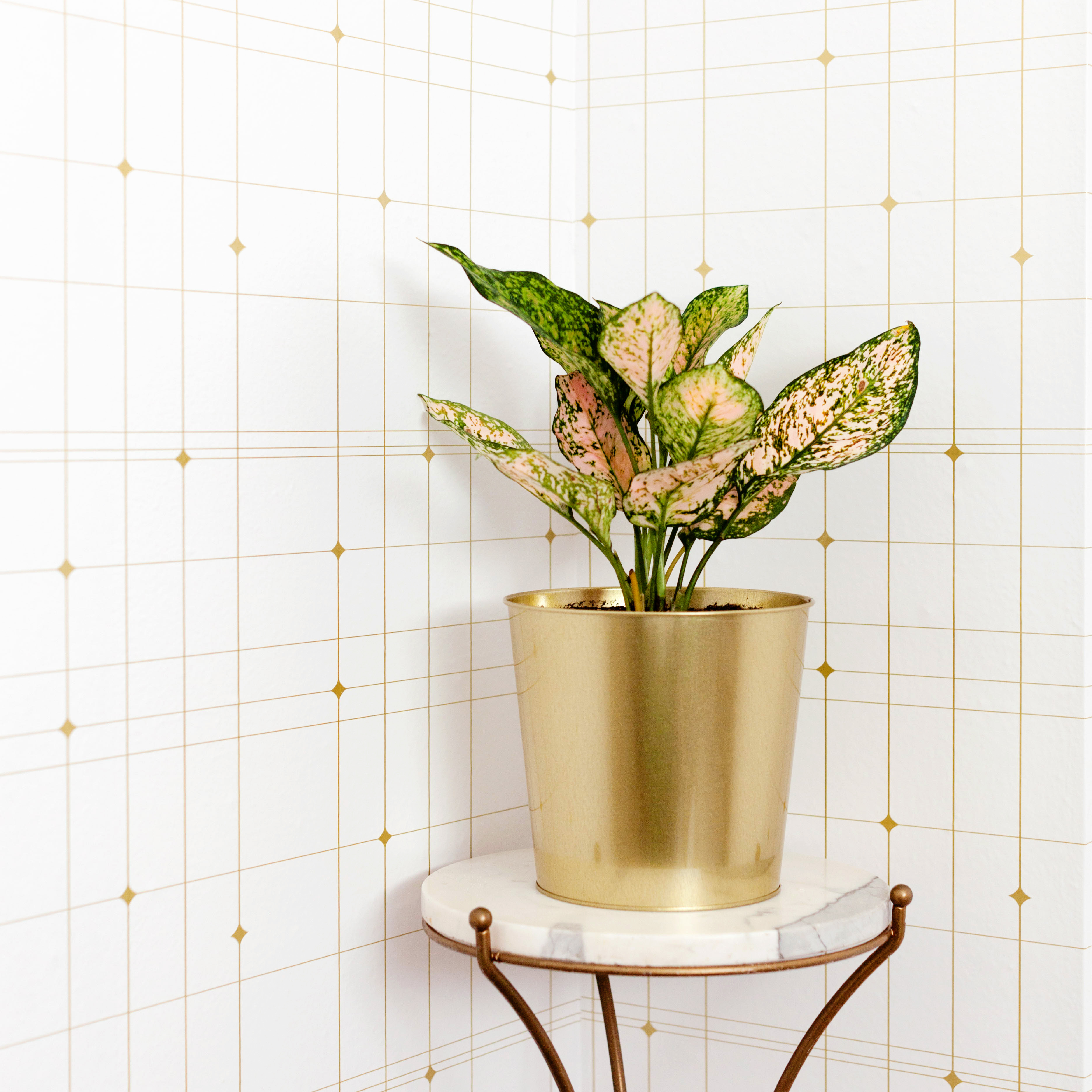
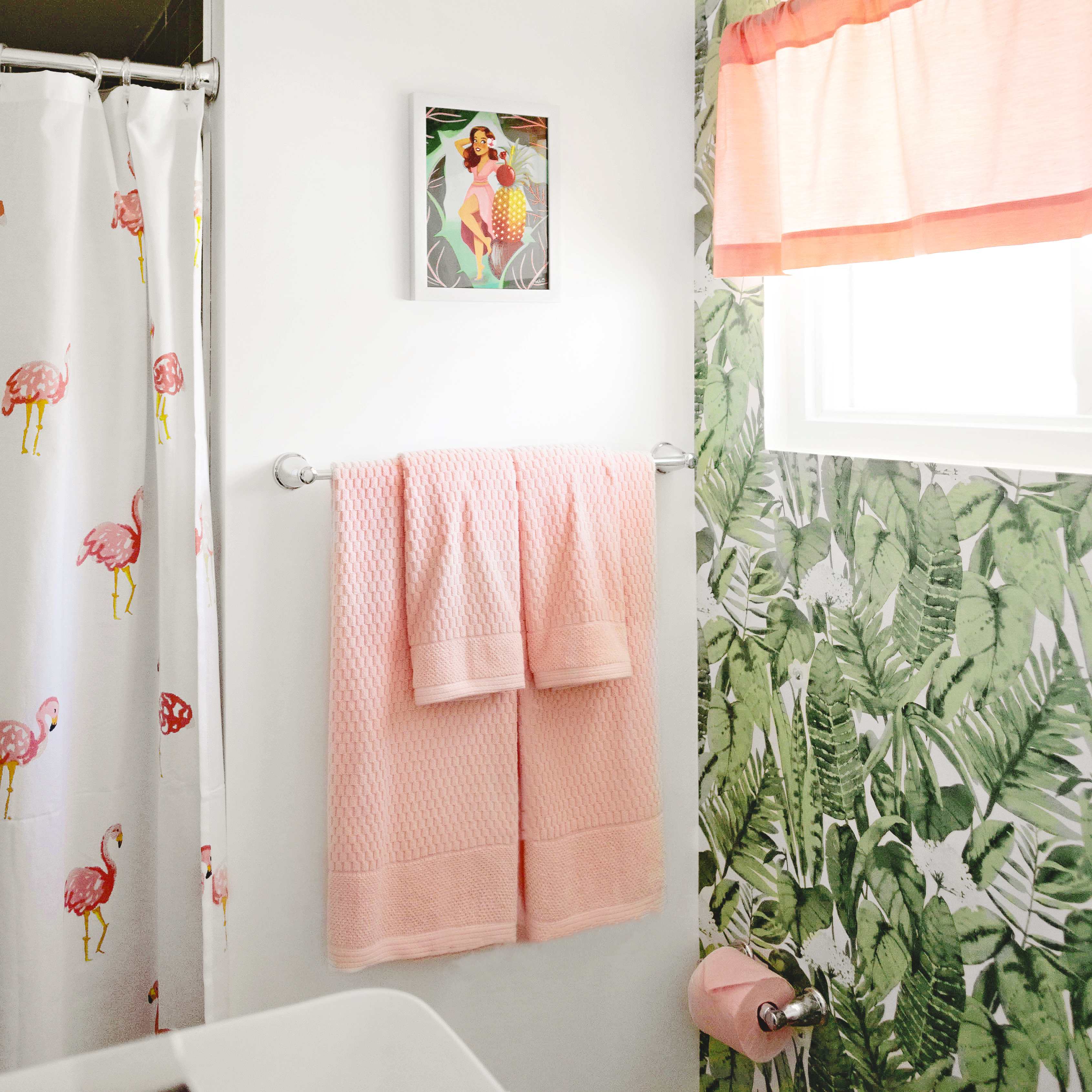
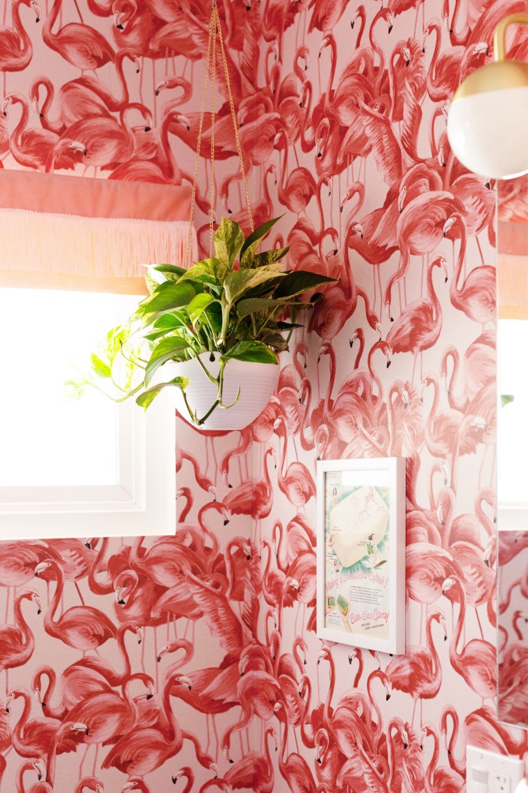 I got this hanging planter on Amazon and changed out the original chain with one from the jewelry making section at Jo-Ann.
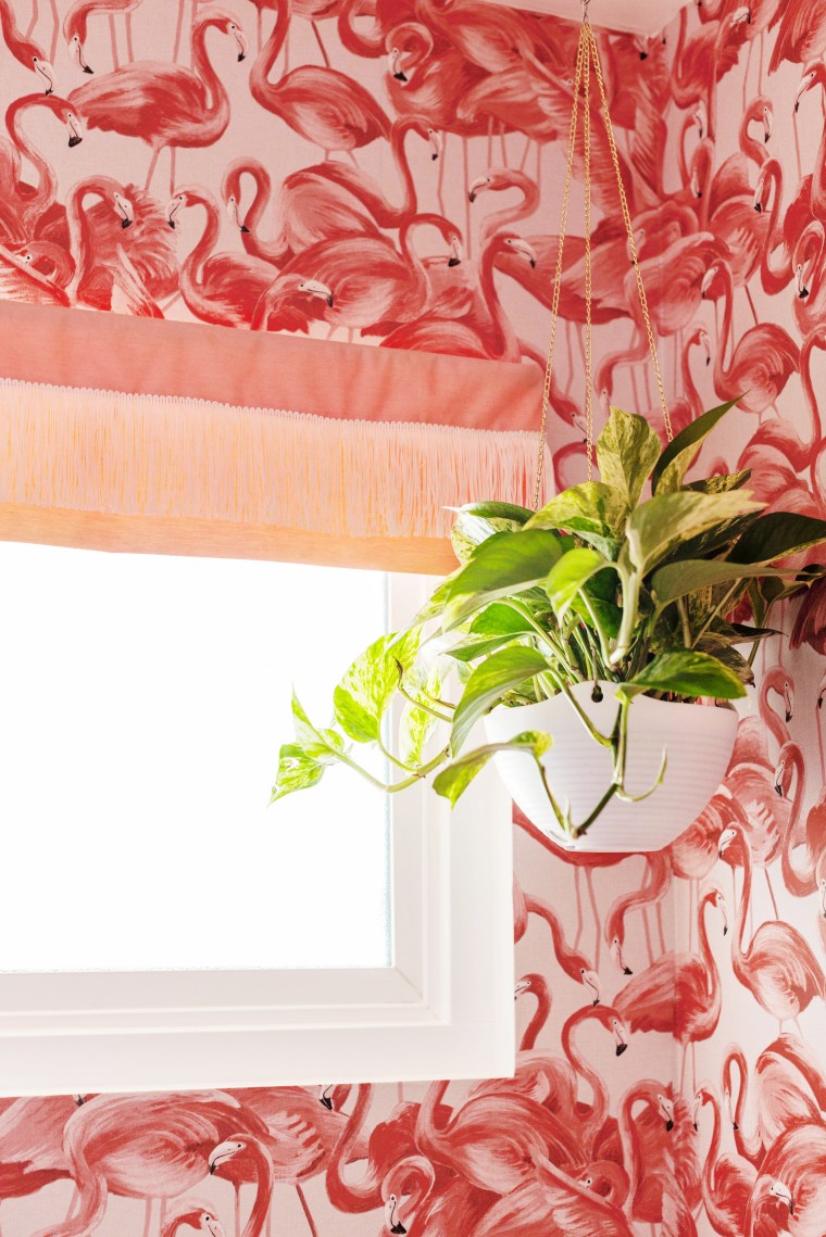 I kept the original window valance and shortened it in order to let more light in. I loved the fringe on the new towels and rug so I added some chainette fringe to tie it all together.
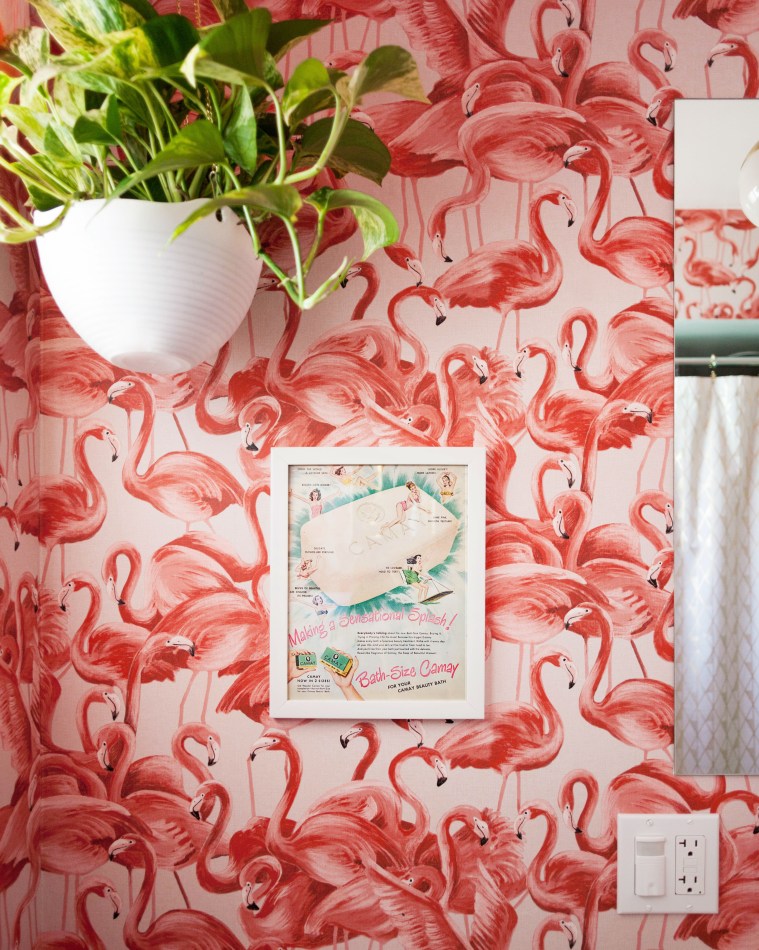 Above the toilet I removed a badly installed towel rack and replaced it with a cute framed vintage Camay Soap ad.
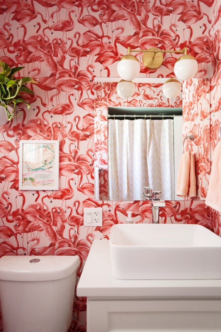 I replaced the light fixture with a new mid-century inspired
 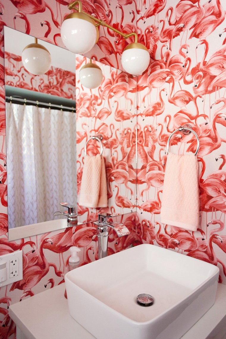 I personally like mixing metals so I went with brass, of course.
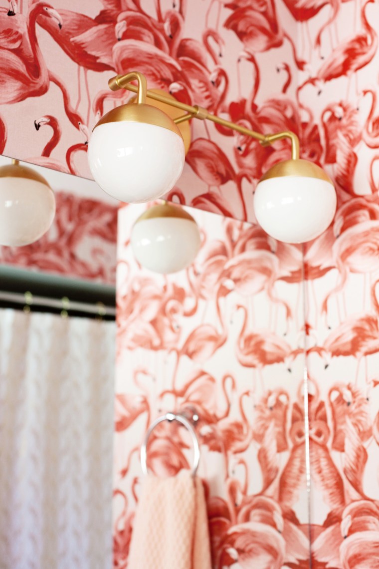
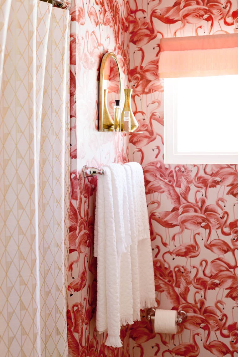 Over on the other wall I picked up a brass mirror/shelf from Target’s Project 62 line and a new metallic gold and white geometric shower curtain from Project 62 as well.
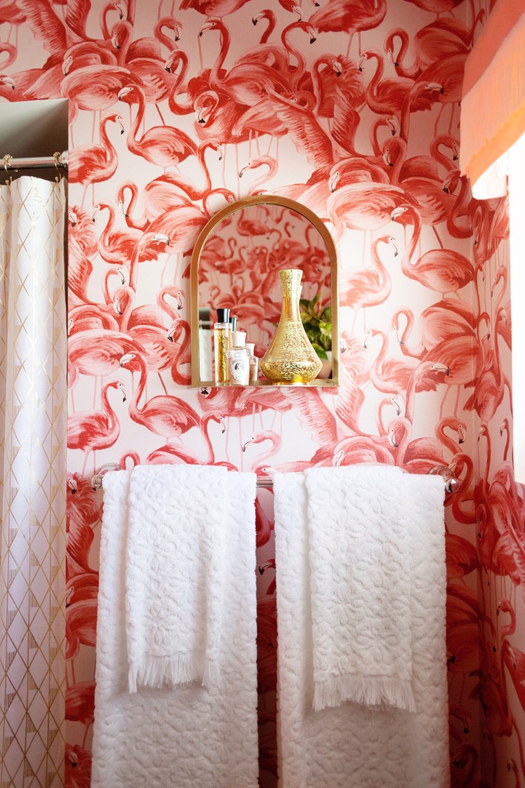 The new “fancy towels” (you know, the kind you’re not allowed to use), are from Target’s Opalhouse line. I love the texture and fringe.
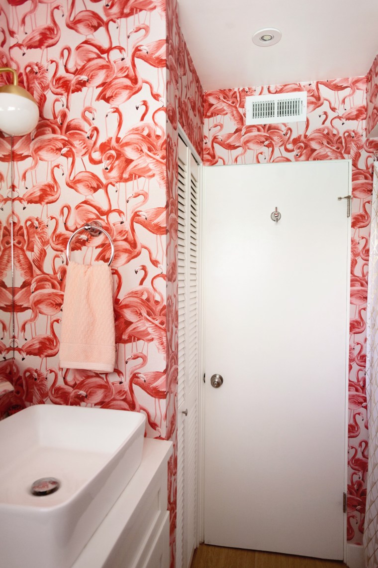 I followed the wallpaper all the way around the room, meeting the last seam in the most inconspicuous corner. Everything is reflected in the mirrors so it’s all pretty much visible from every view point, which was intentional and I’m glad it worked out.
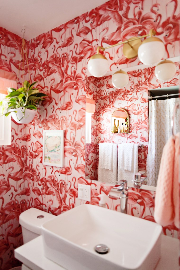 There it is! This year’s new bathroom look. I looooove the way it all came together. Yay!

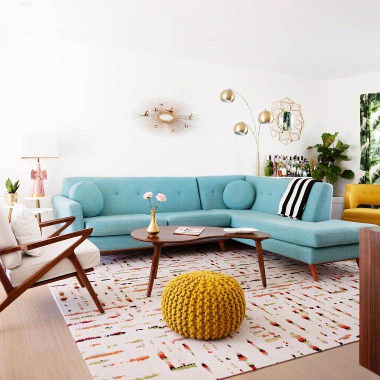 The vintage Curtis Jere brass sculpture above the sofa was in bad shape when I found it at the Long Beach Flea Market but with a lot of patience I was able to fix it up and make it look great again. The Stangl Pottery vase on the coffee table is another vintage score from Long Beach.
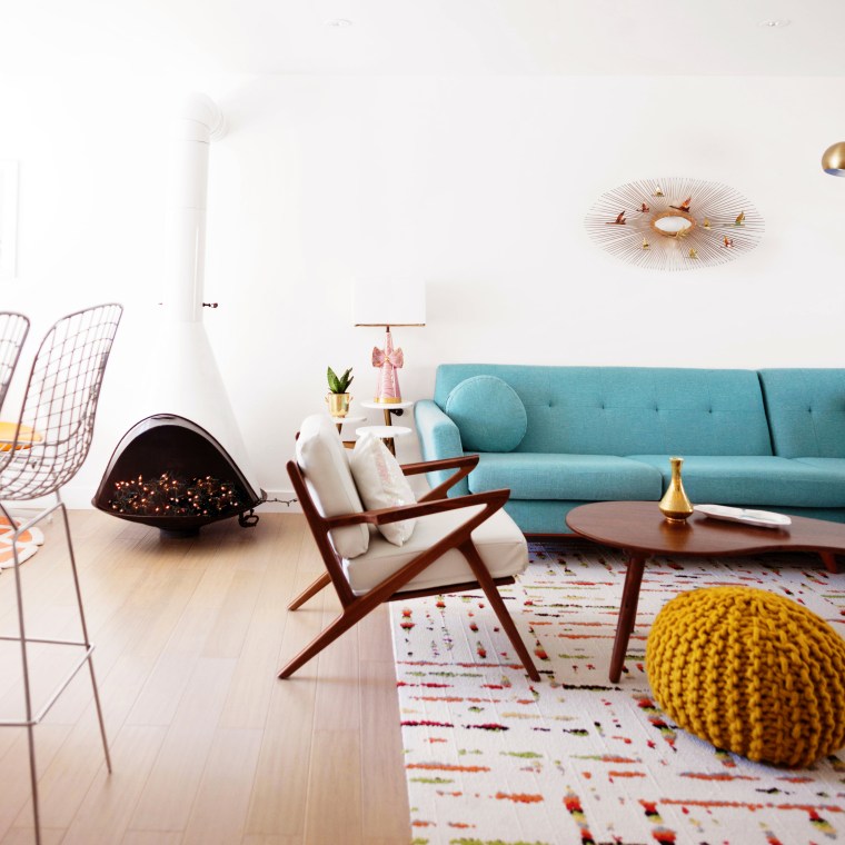
 We added the conical fireplace to give the space a little more architectural detail. I found it on Craigslist and picked it up from the house it had been in since 1960. It doesn’t function in here but it has a little electric log and is stuffed with twinkle lights for ambience.
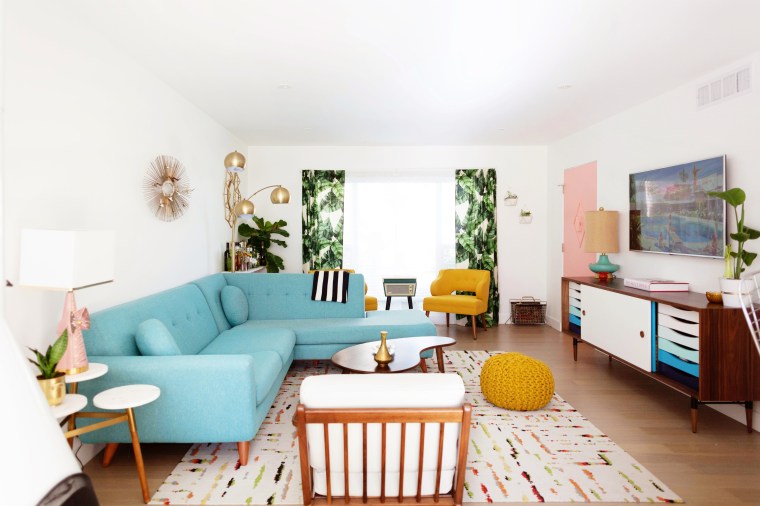
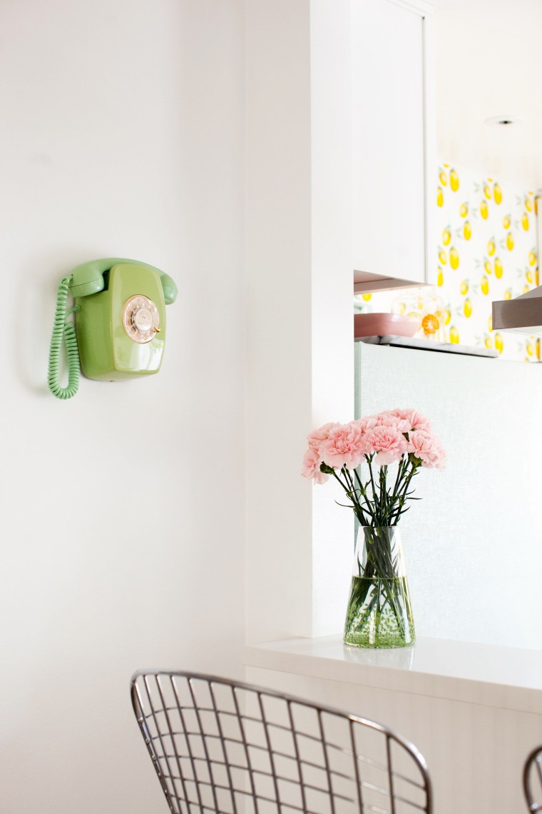 I try to add little moments around each room to give every corner a touch of character. I used a vintage rotary phone and vase from Baigelman Glass to add some color to this area by our breakfast bar.
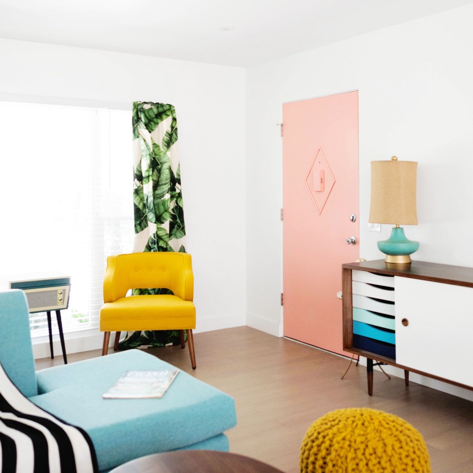
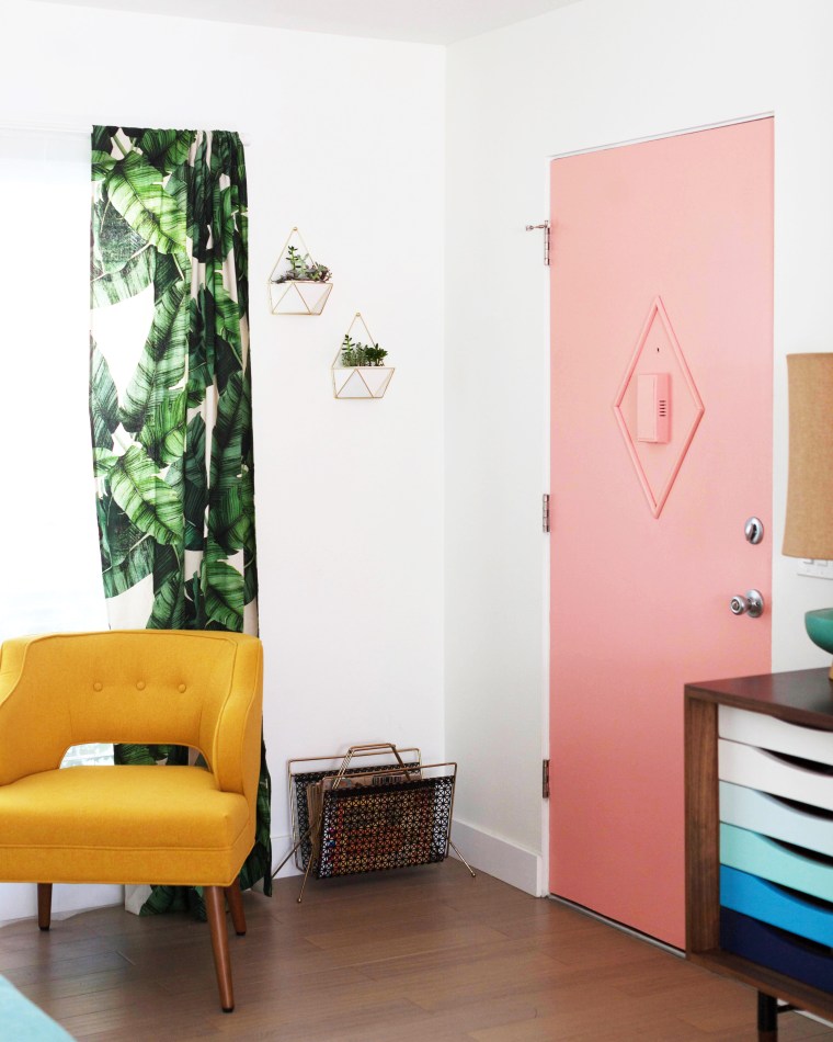 To this corner I added wall hanging planters and a vintage magazine stand filled with home decor magazines from the 50s and 60s. And lastly I painted the front door a peachy pink (Peach Punch from Valspar to be exact) and added a little bit of retro detail with wood molding!
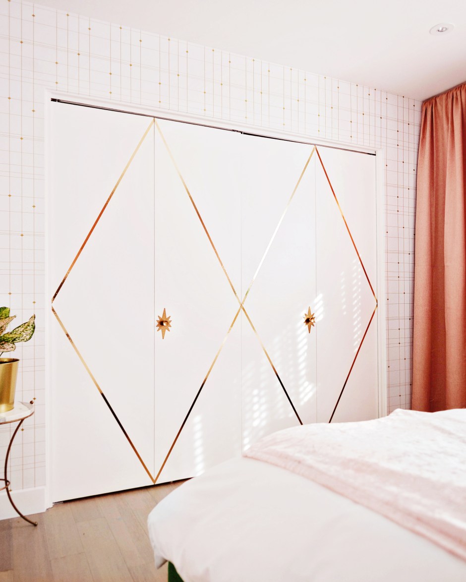
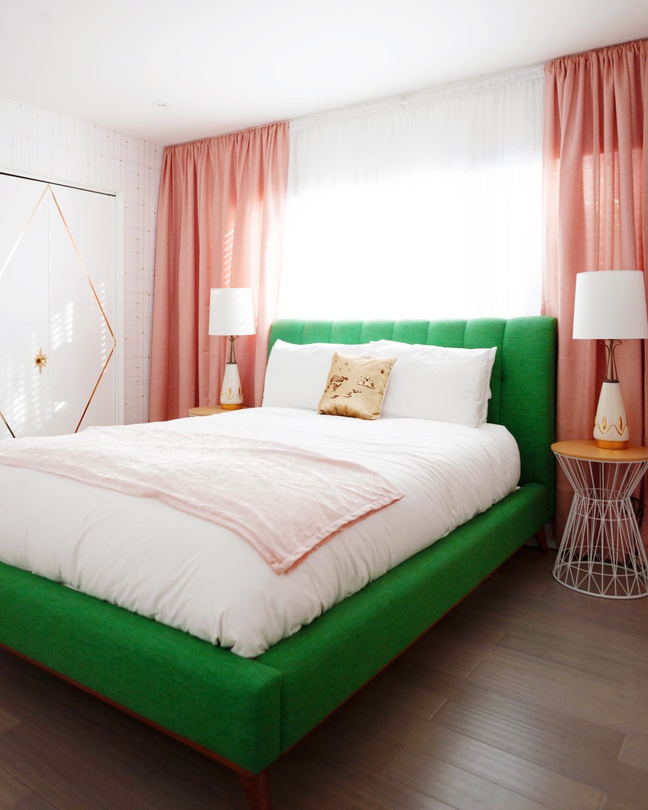
 Putting a bed in front of a window like this can look a little awkward, so the first thing I did was hung wall-to-wall, floor-to-ceiling shimmery coral-pink curtains and sheers from Target to frame the bed and disguise the window, while still letting tons of light in.
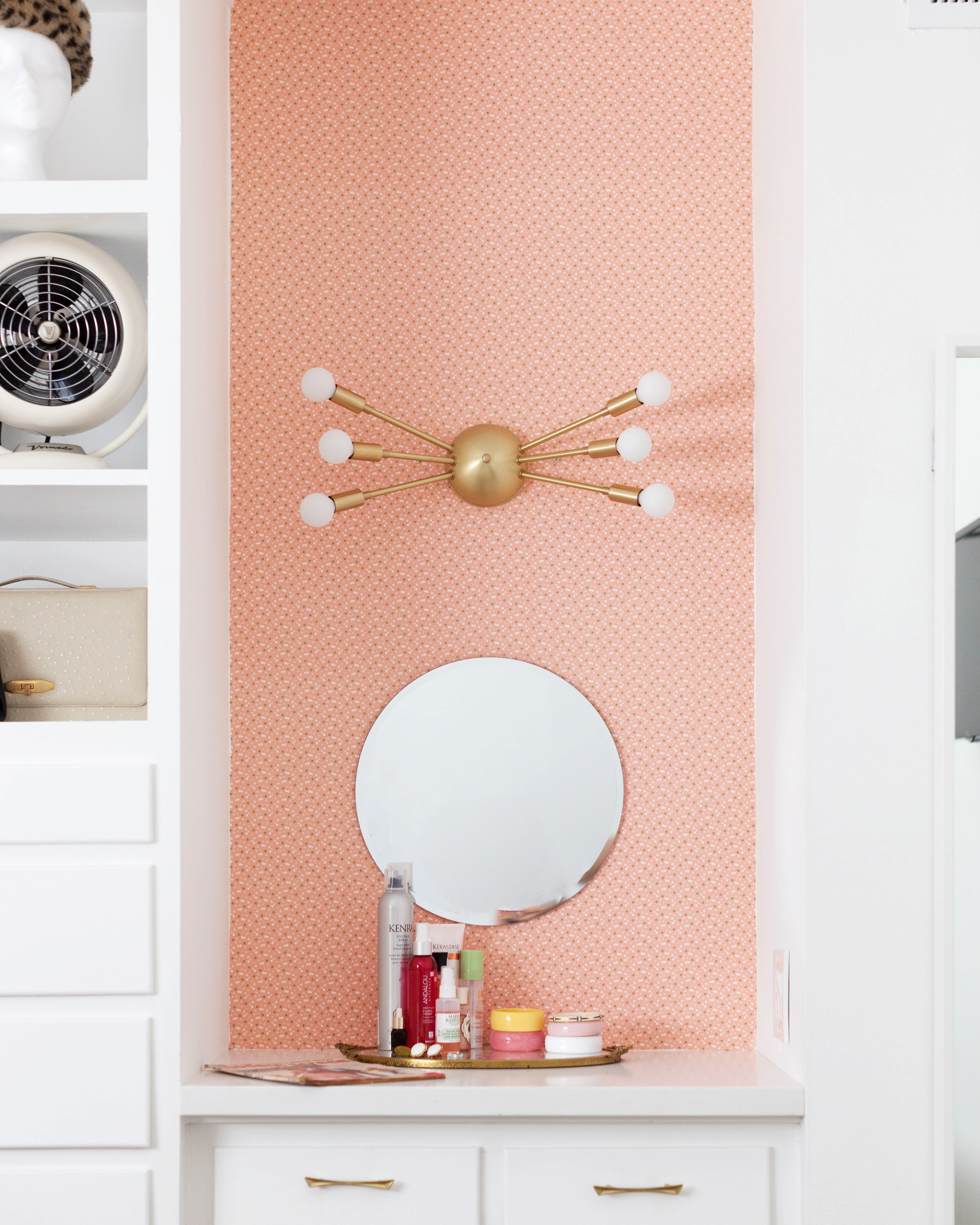 I used a fabric in a similar color to do
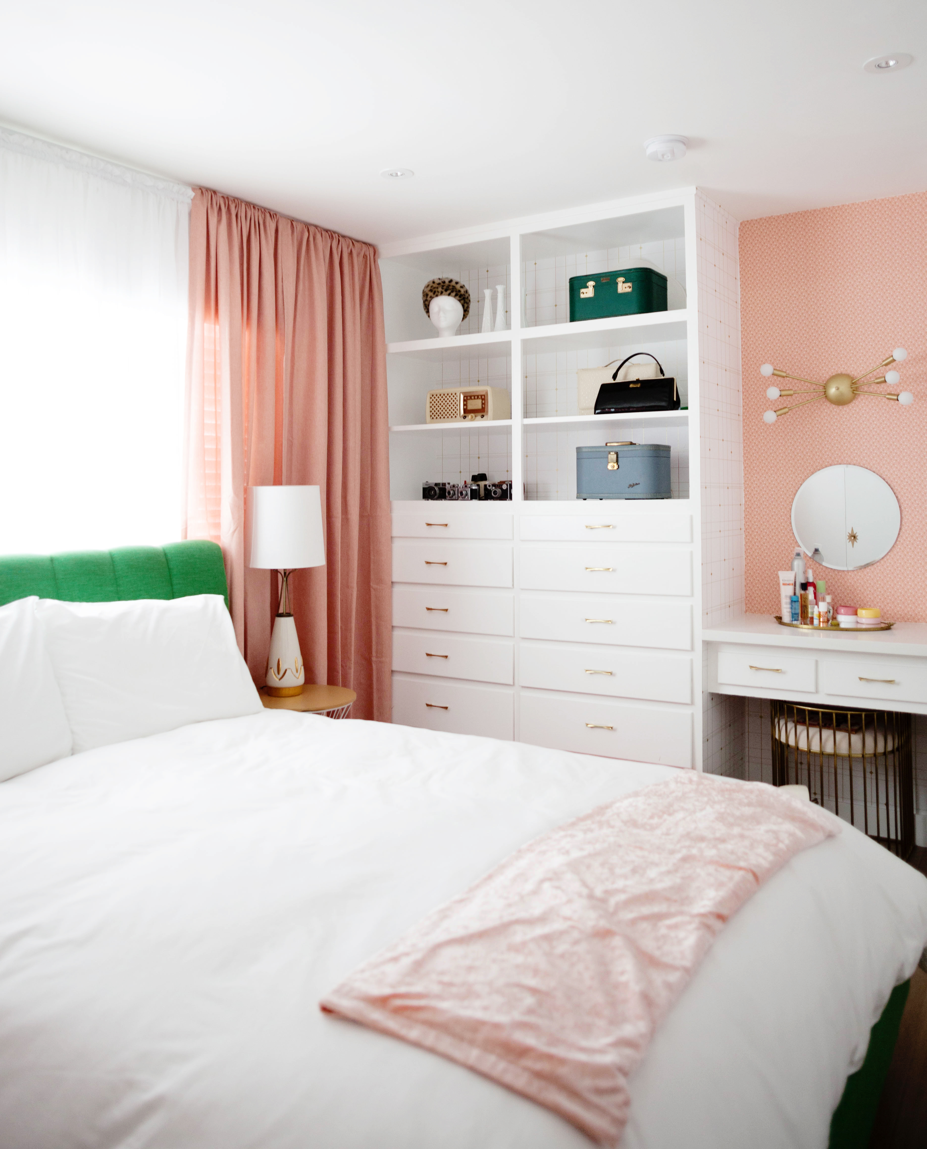
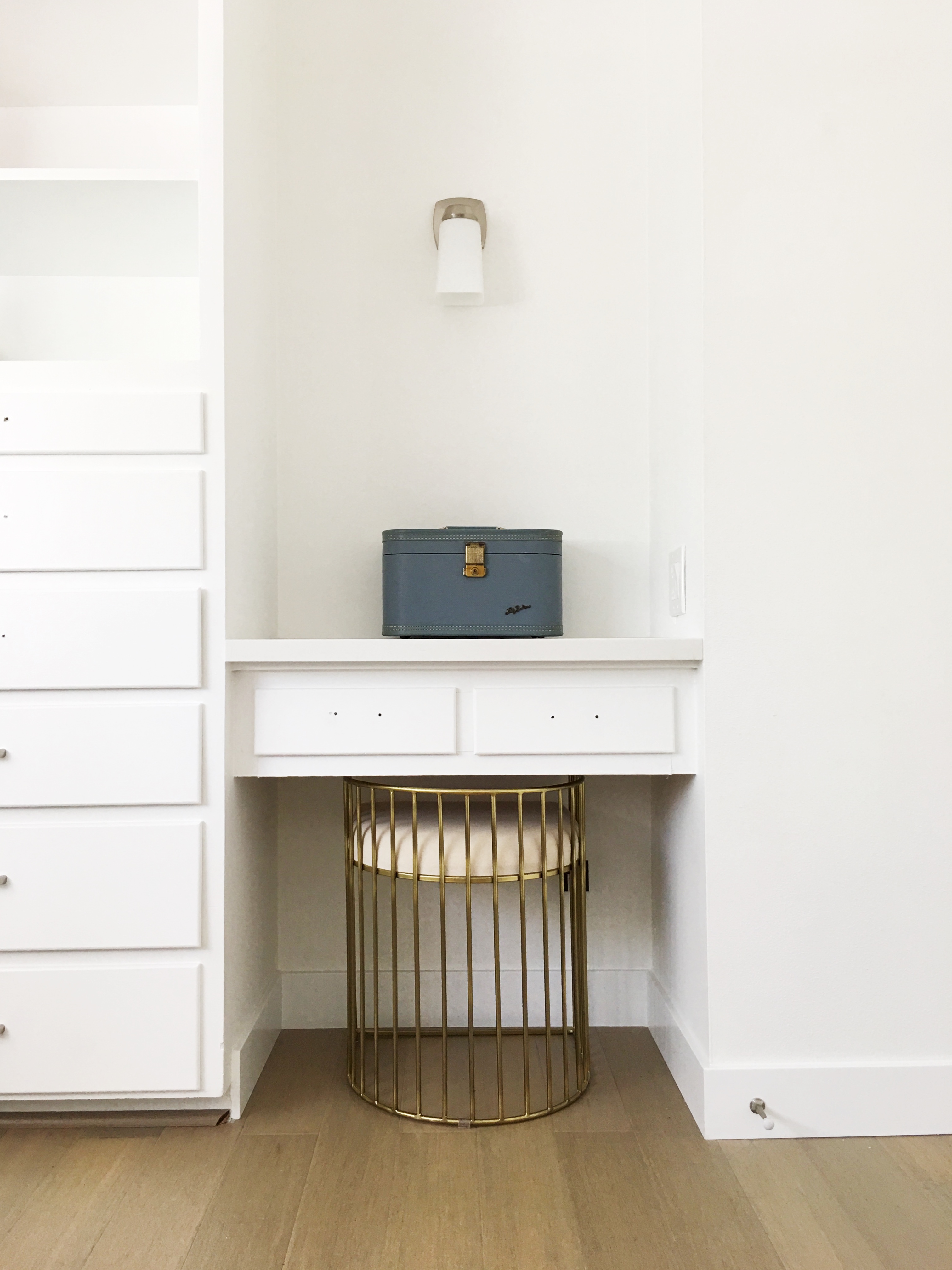
 I installed a beautiful
 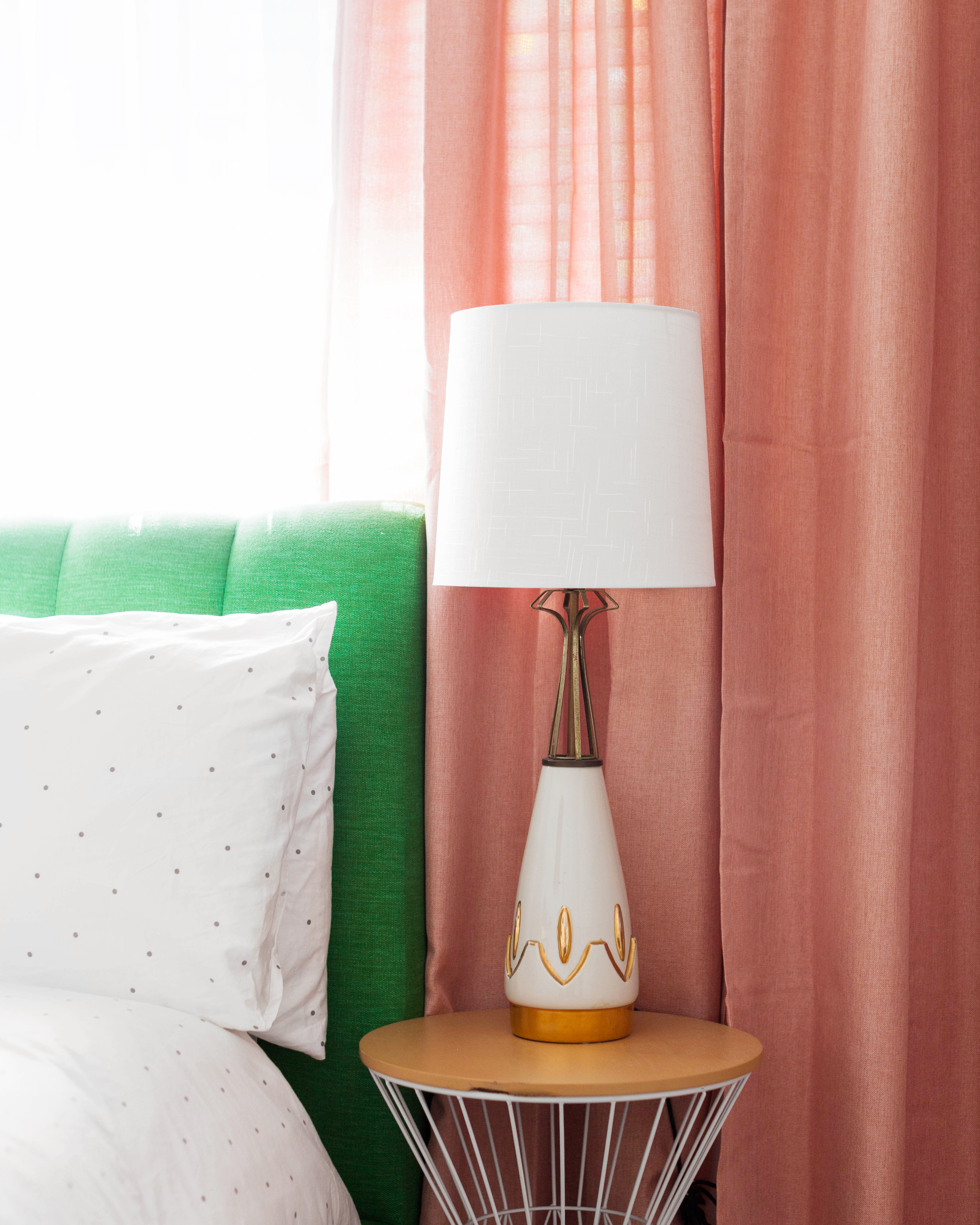 Lamps are a vintage find from Etsy! Shades are from the Project 62 line at Target.
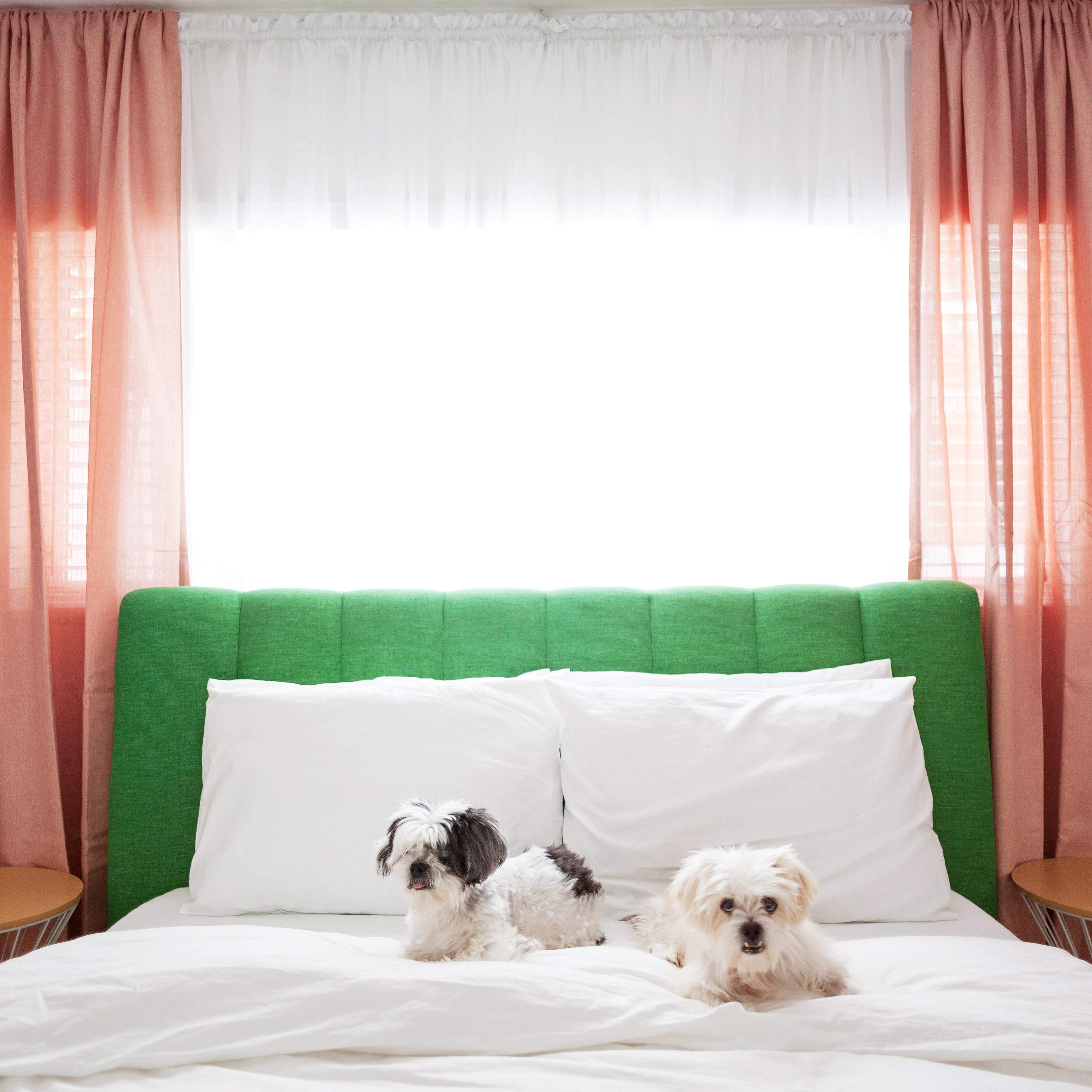
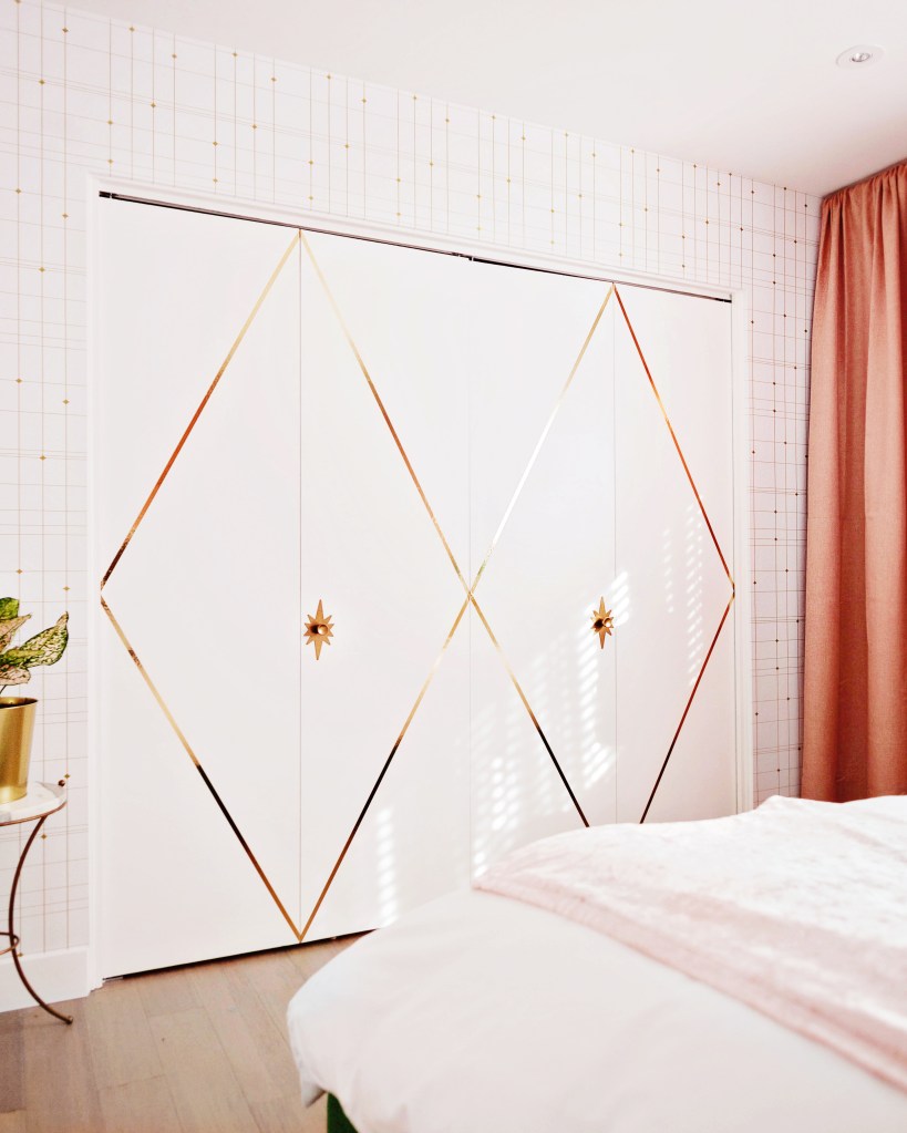
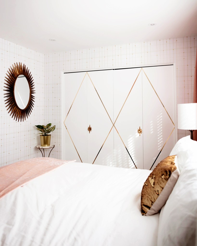
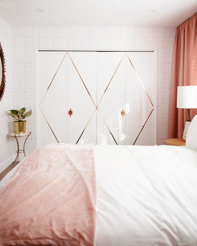
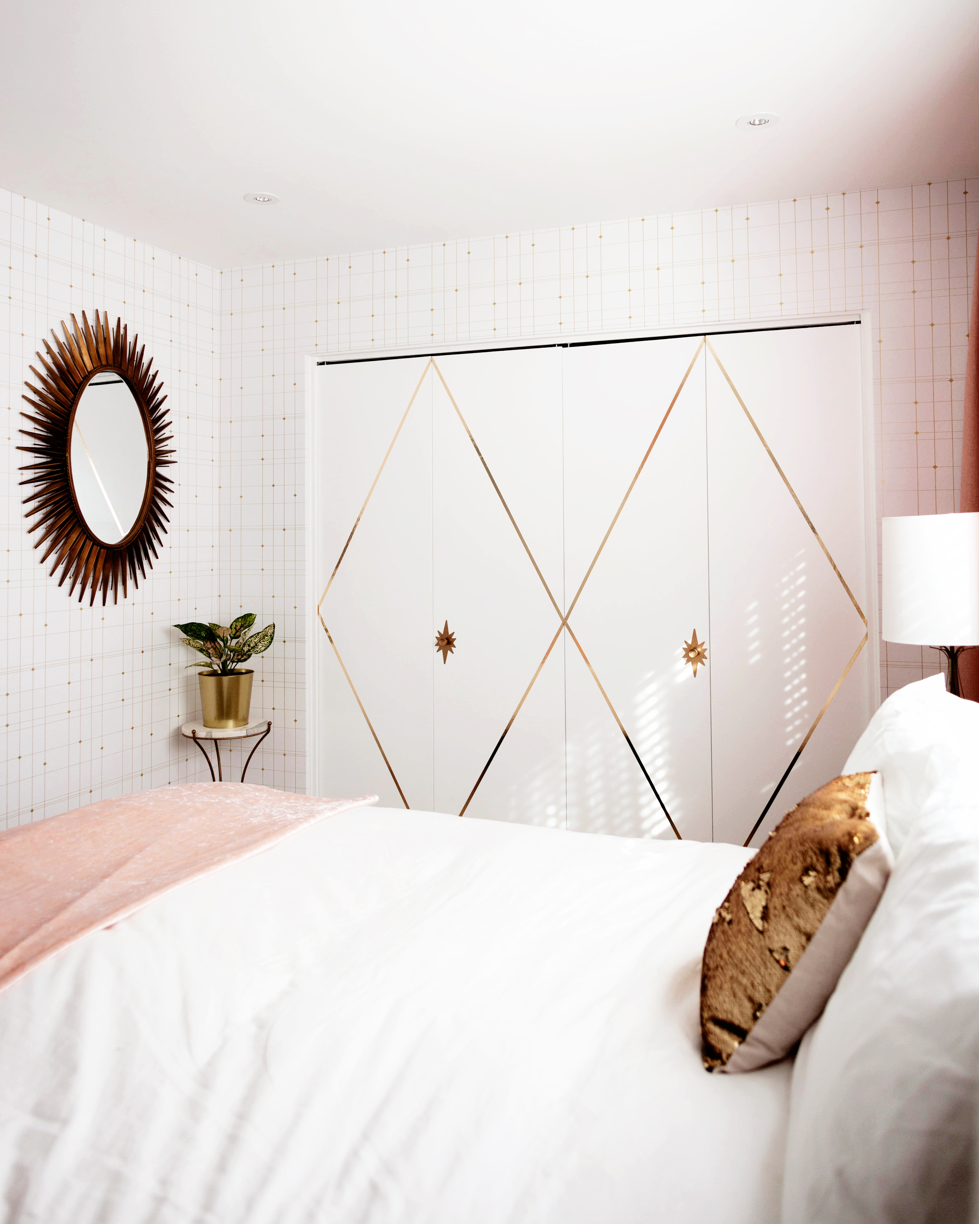 We had our tv mounted in front of the bed for our viewing pleasure. To jazz up the boring closet doors I used metallic gold tape and changed the knobs out to starburst ones from Etsy. The oval starburst
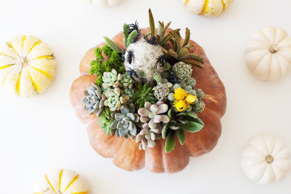
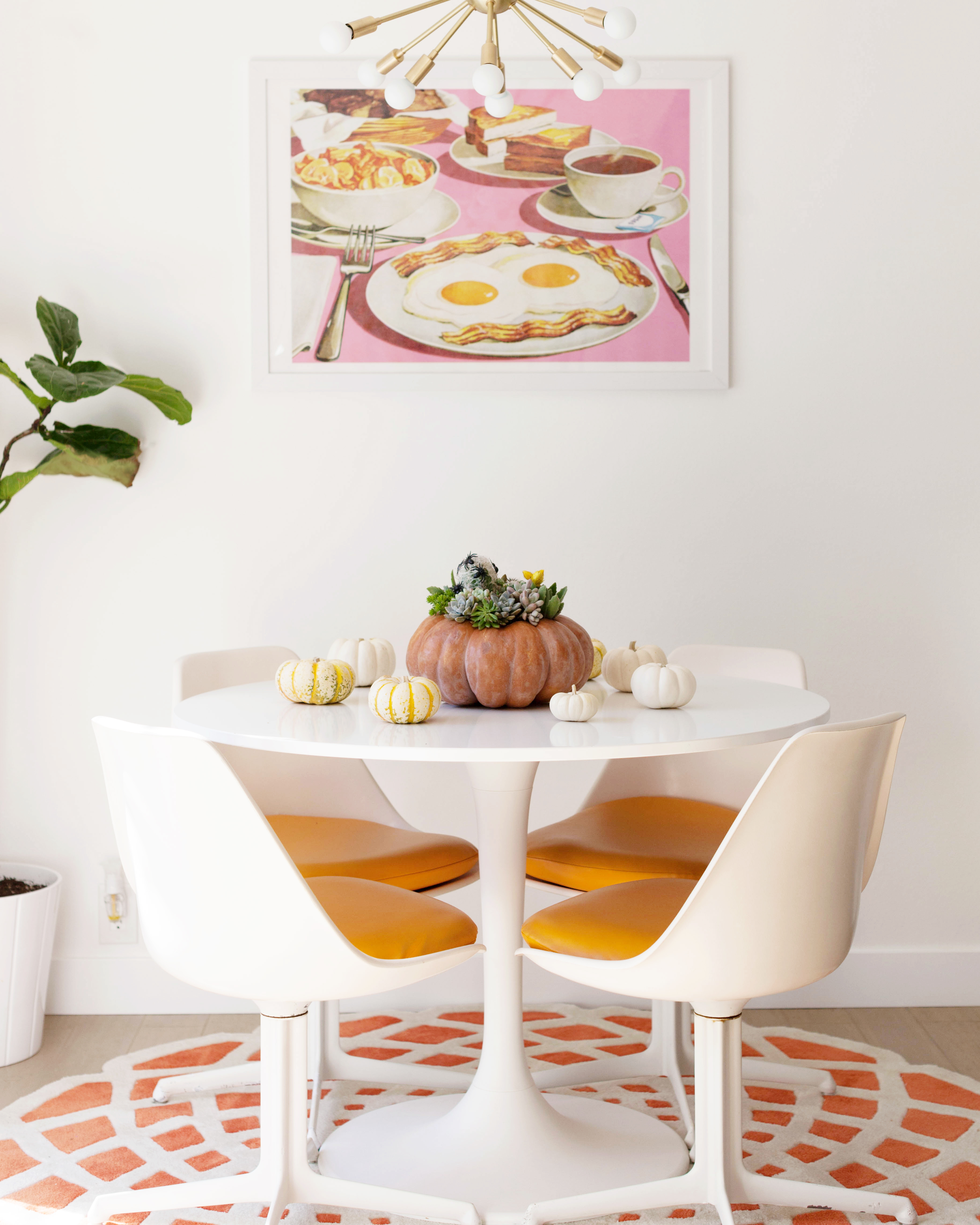
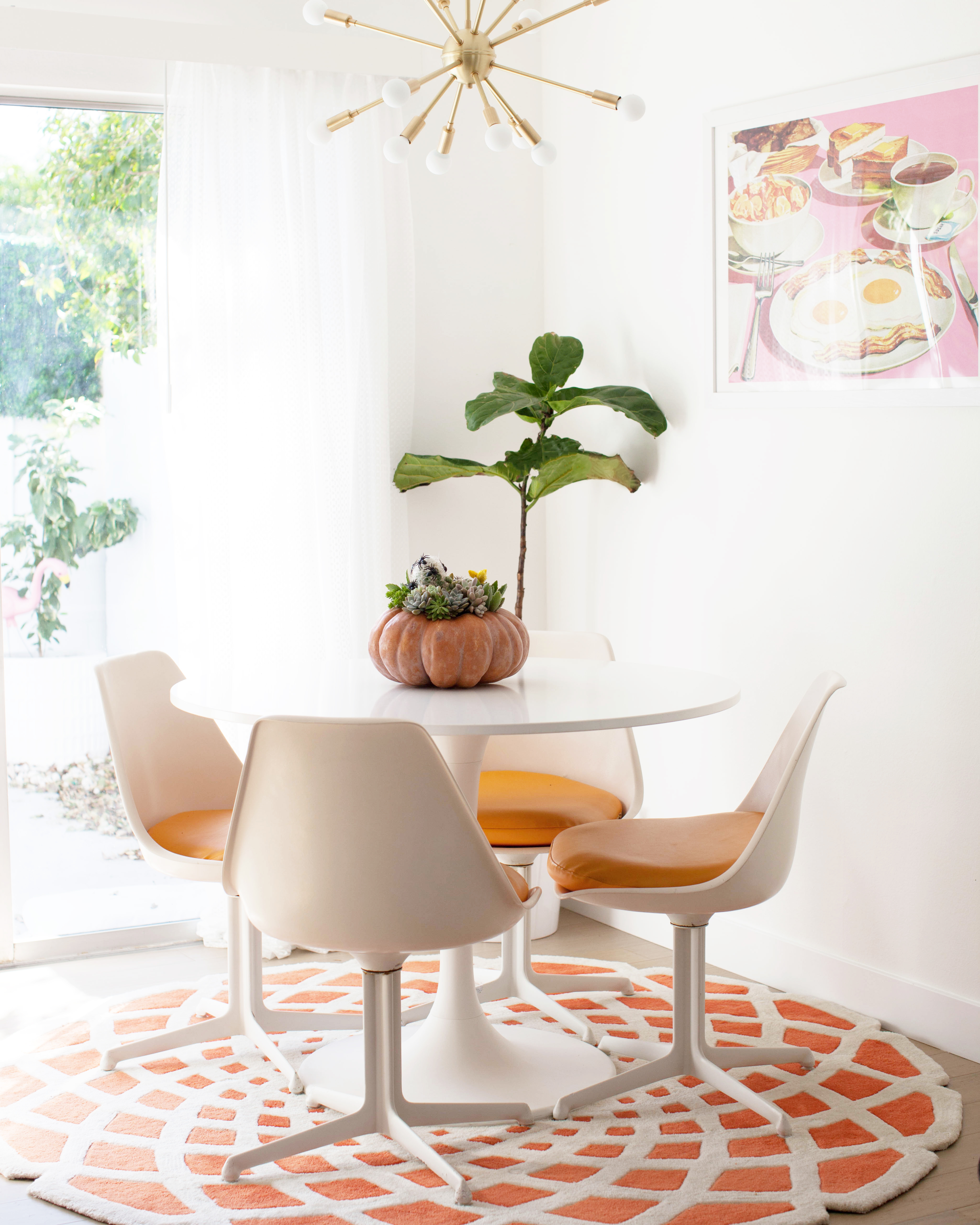
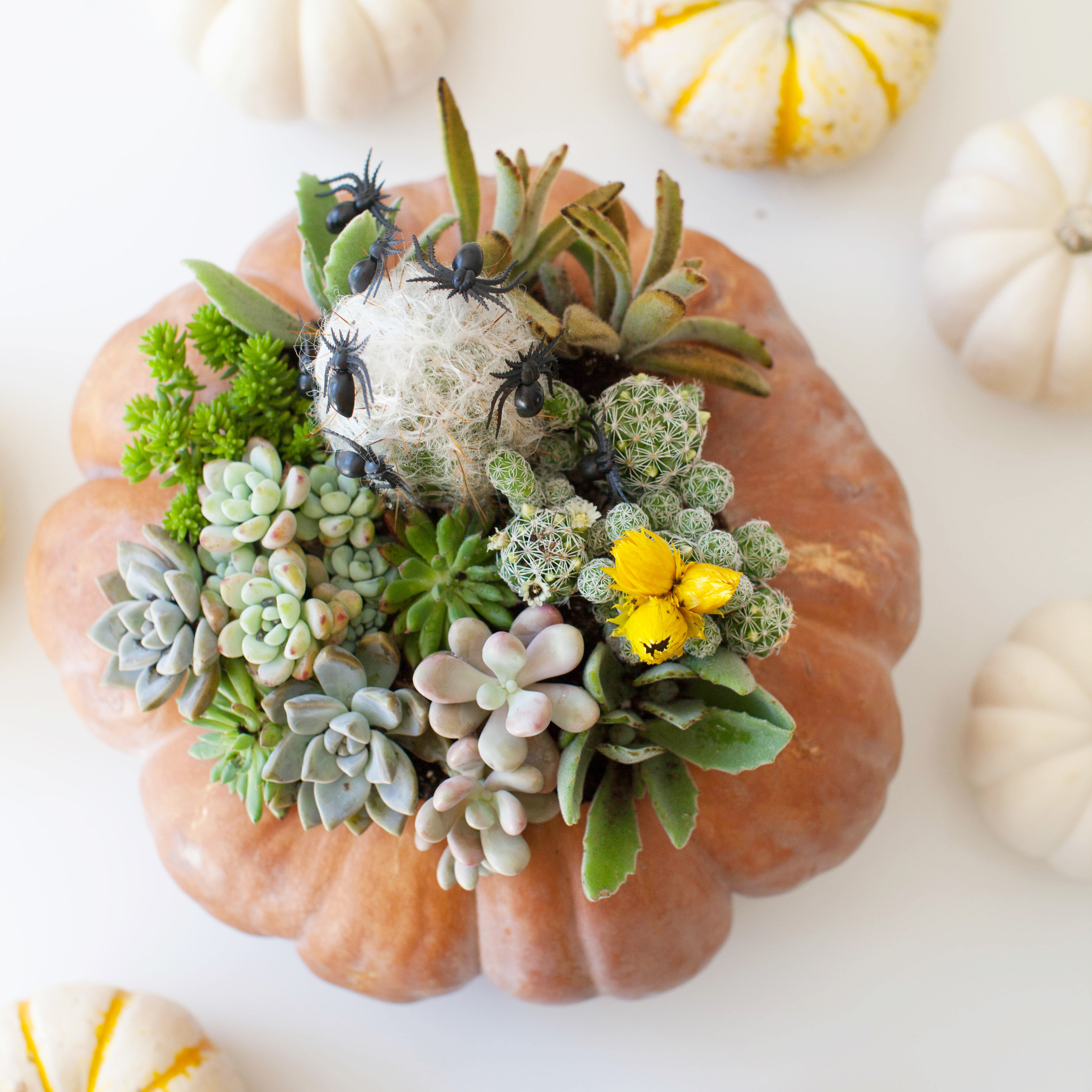 I love it as our dining table centerpiece.
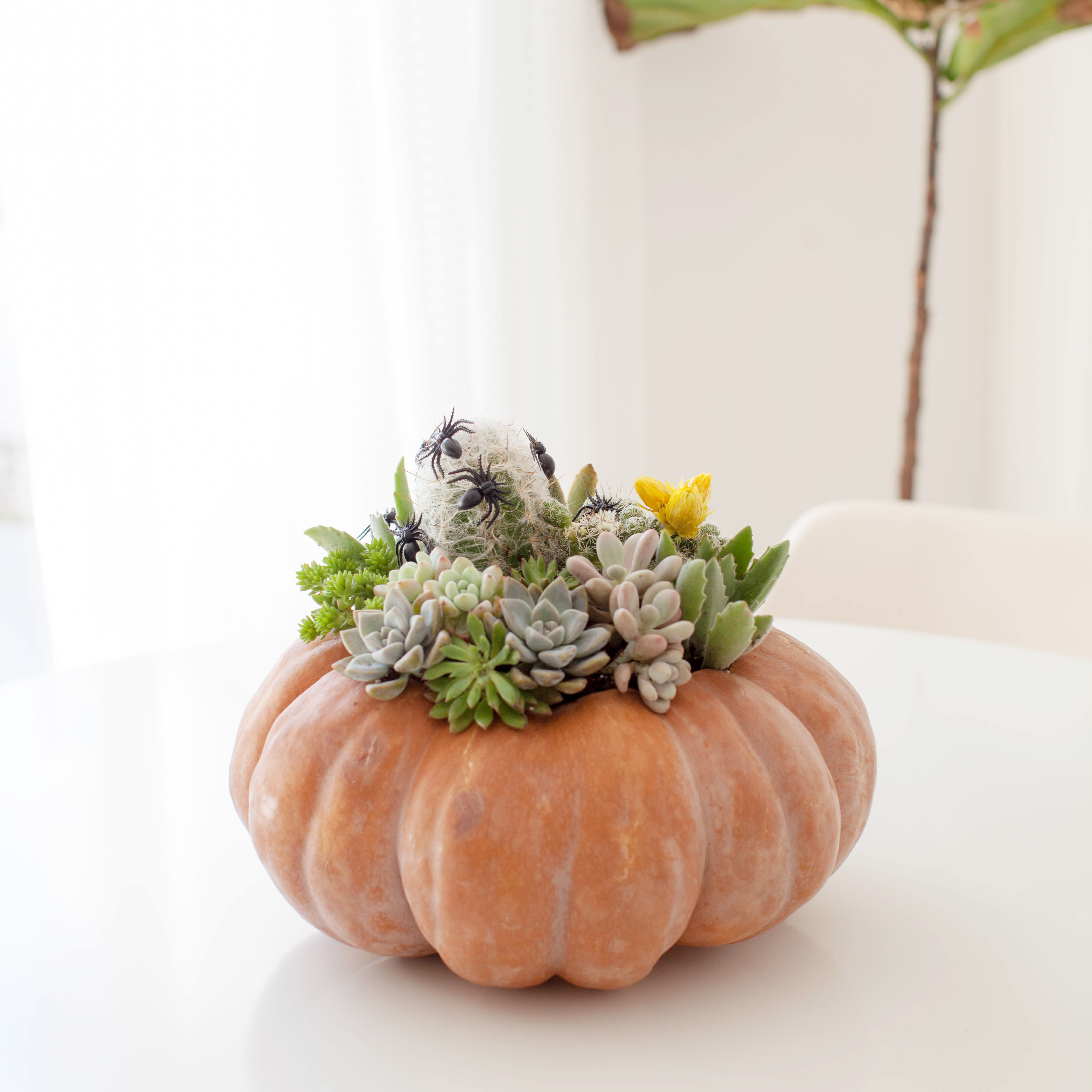


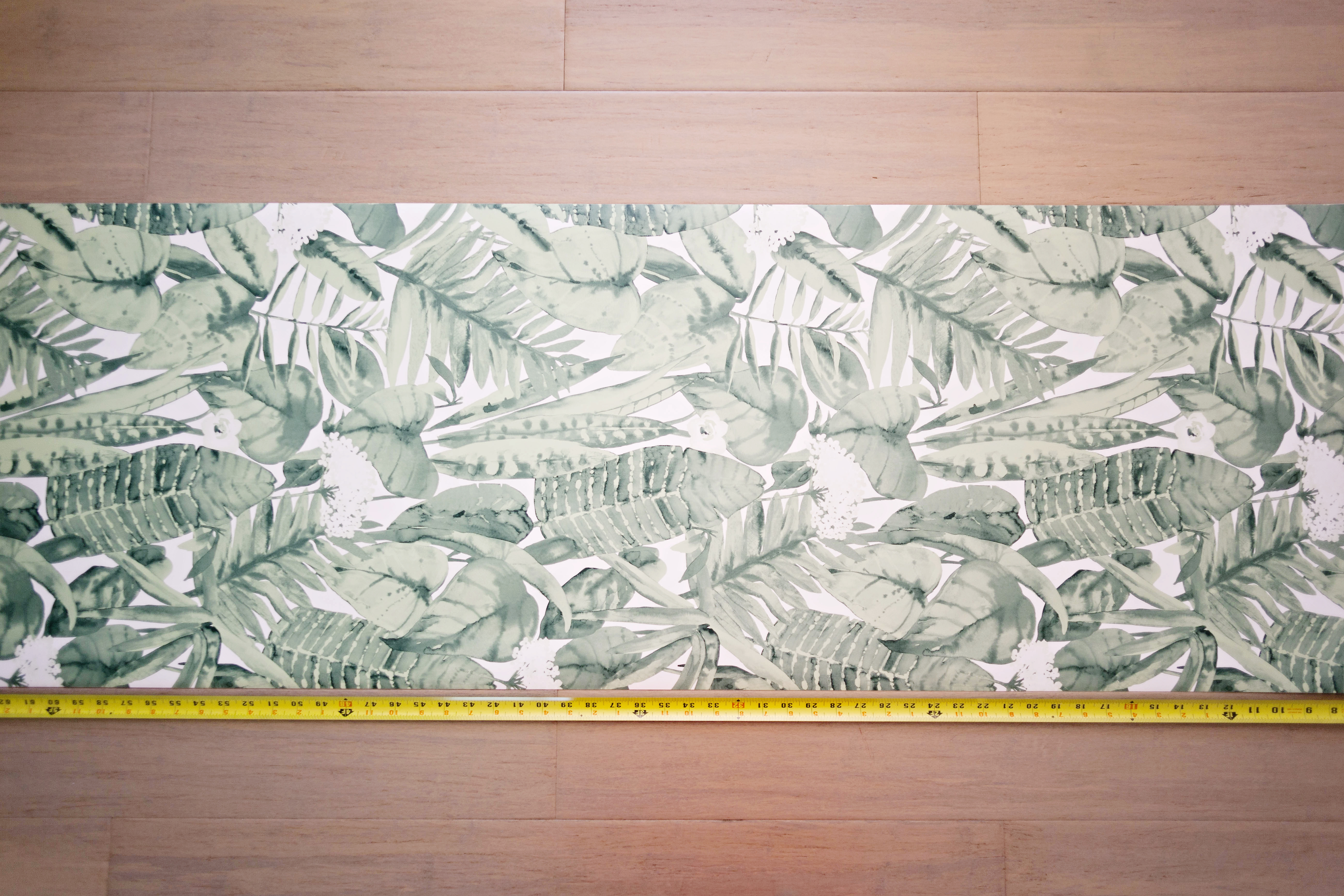 Next, pre-cut the lengths you need. This makes your life so much easier. Be sure to line up the pattern with each new piece you cut.
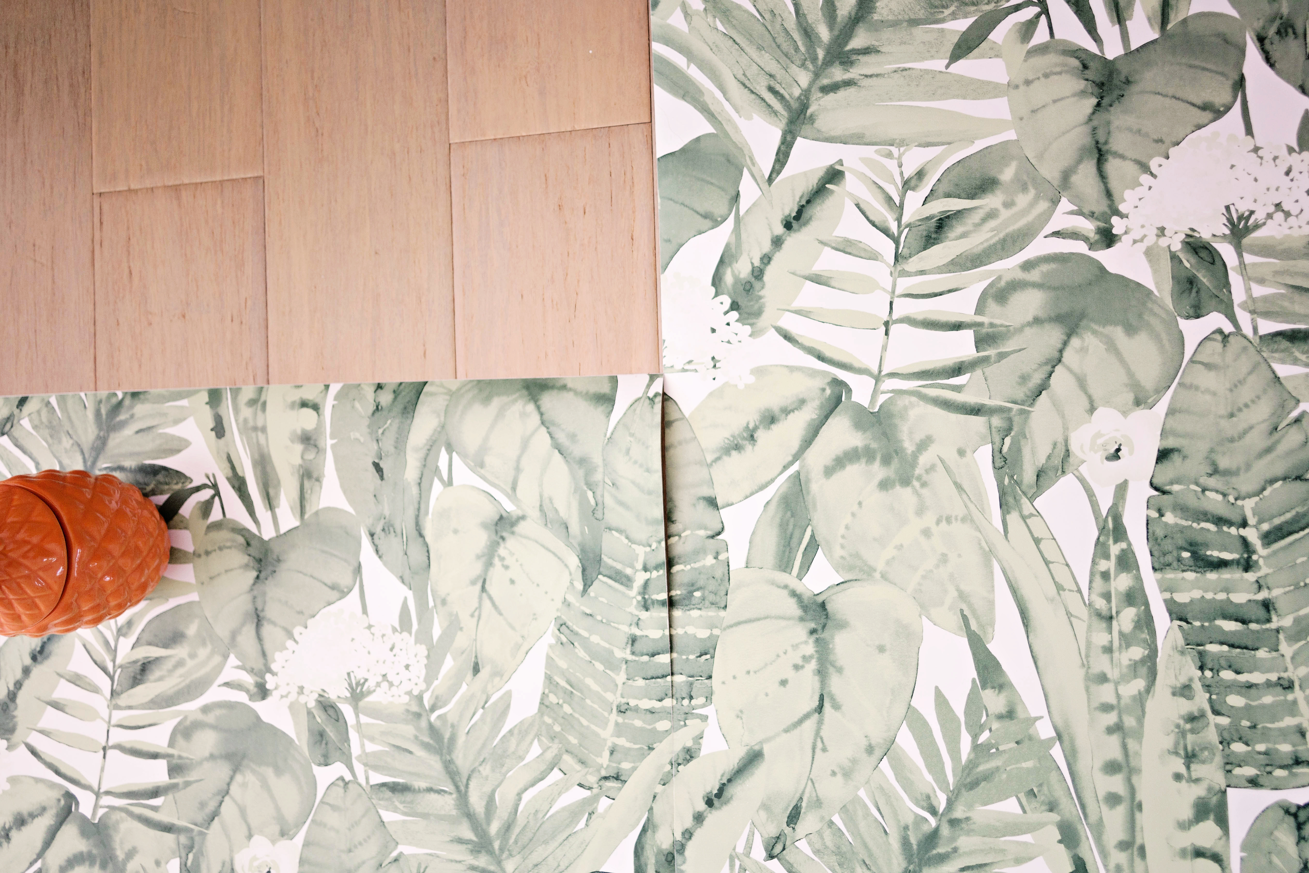
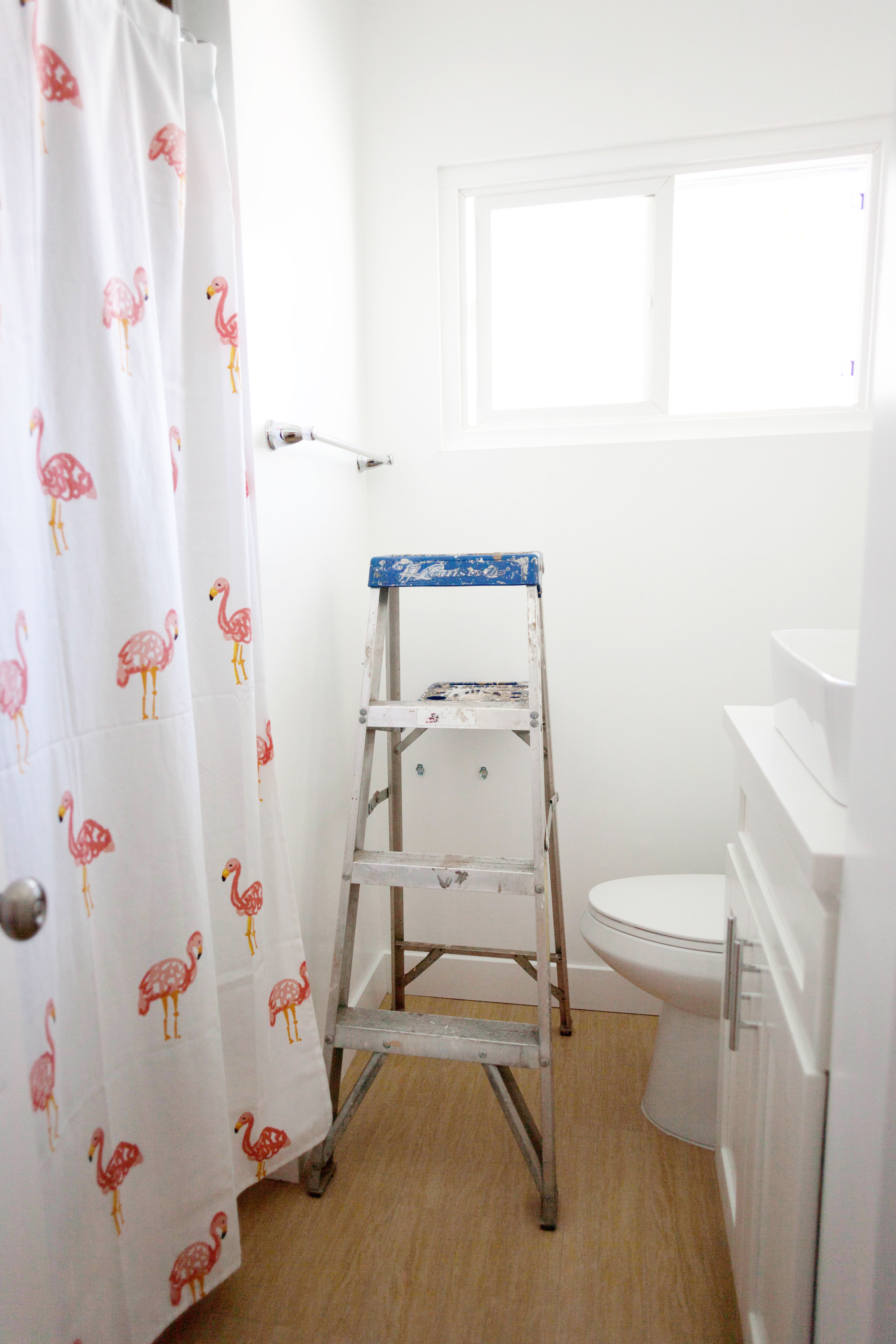
 And that’s it! If you’re wondering how well this paper might hold up in a bathroom, I’ll just say I took a steamy shower about an hour after I was done and no seams or edges came away from the wall. The paper is also non-porous, so it seems it’ll hold up to moisture well.
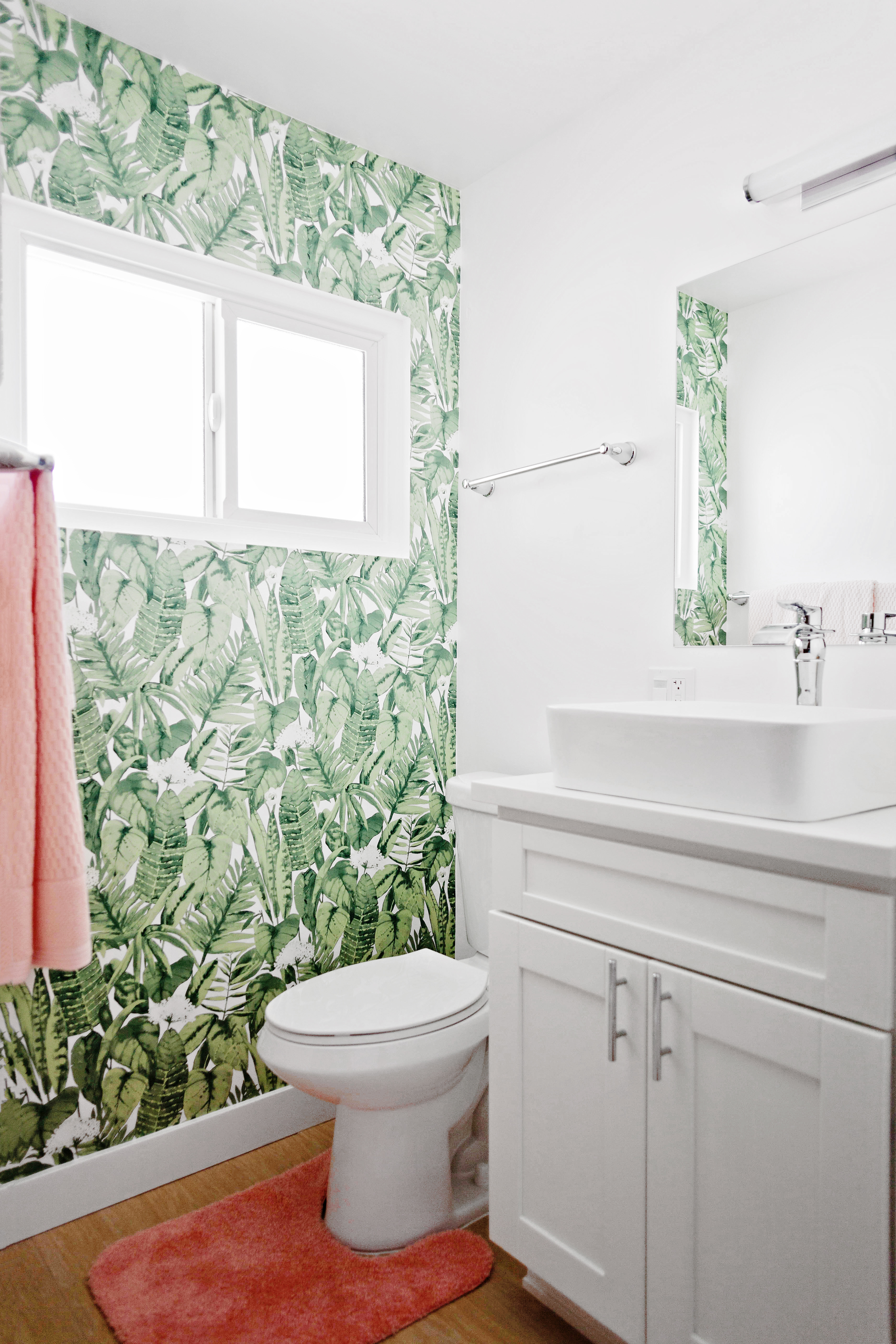
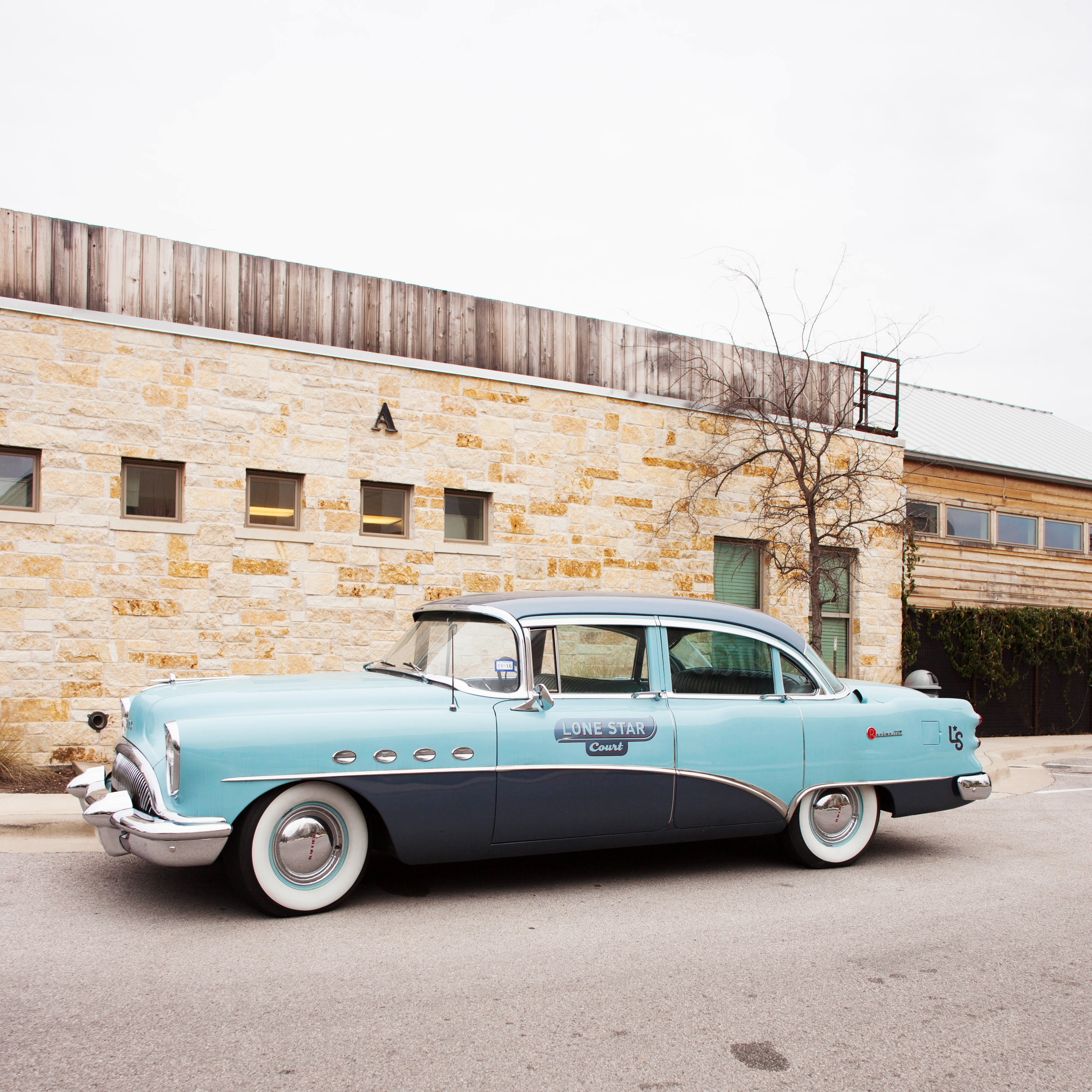
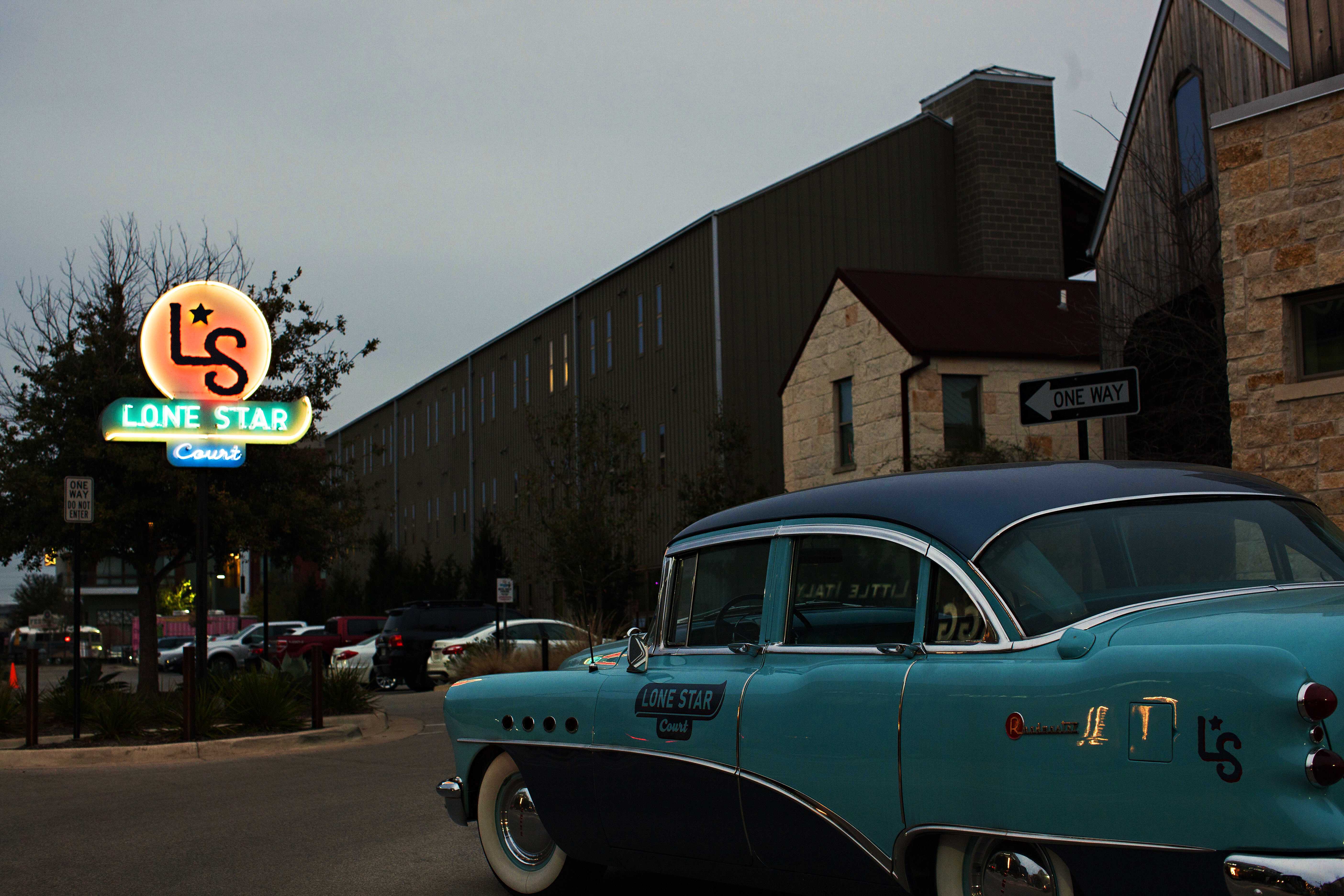
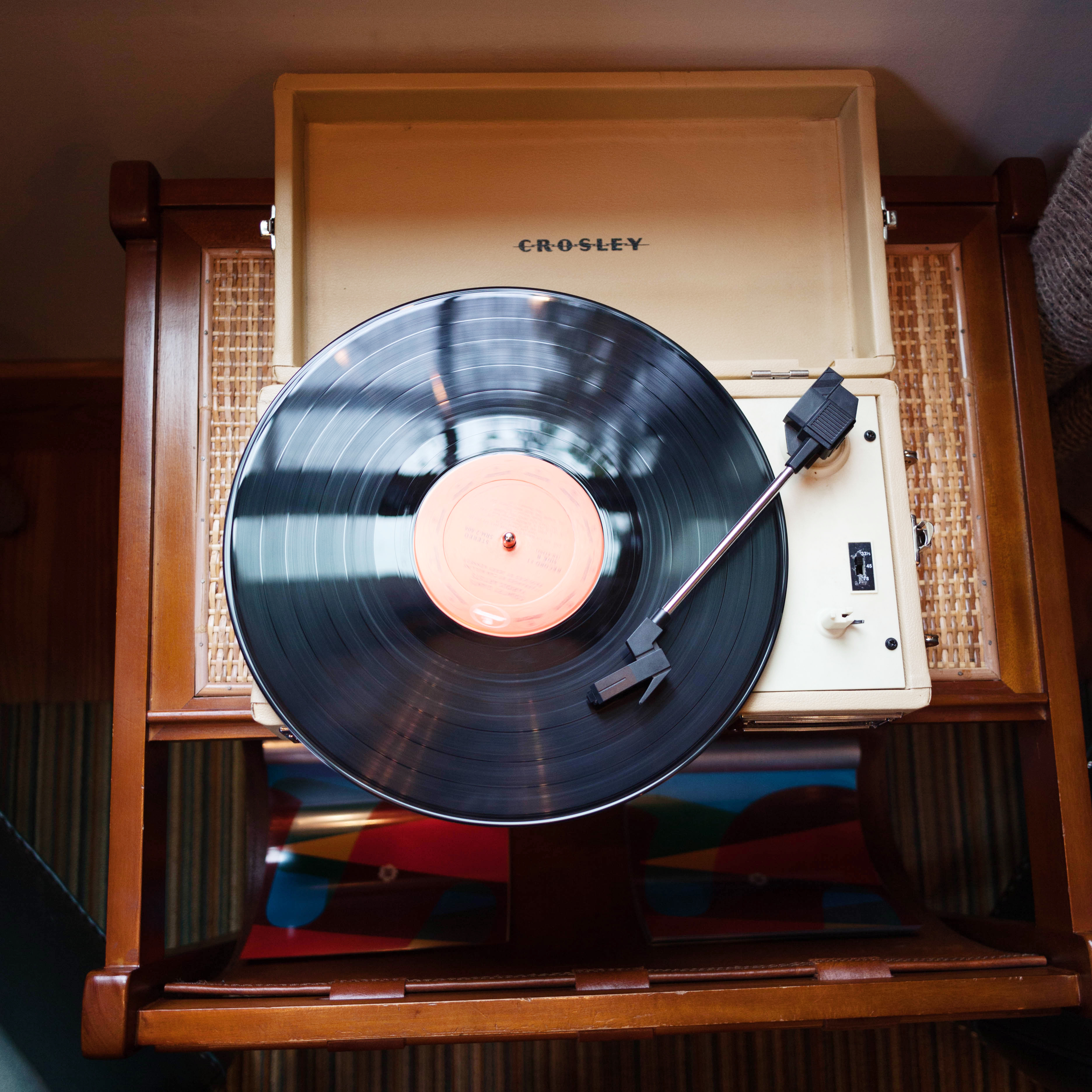
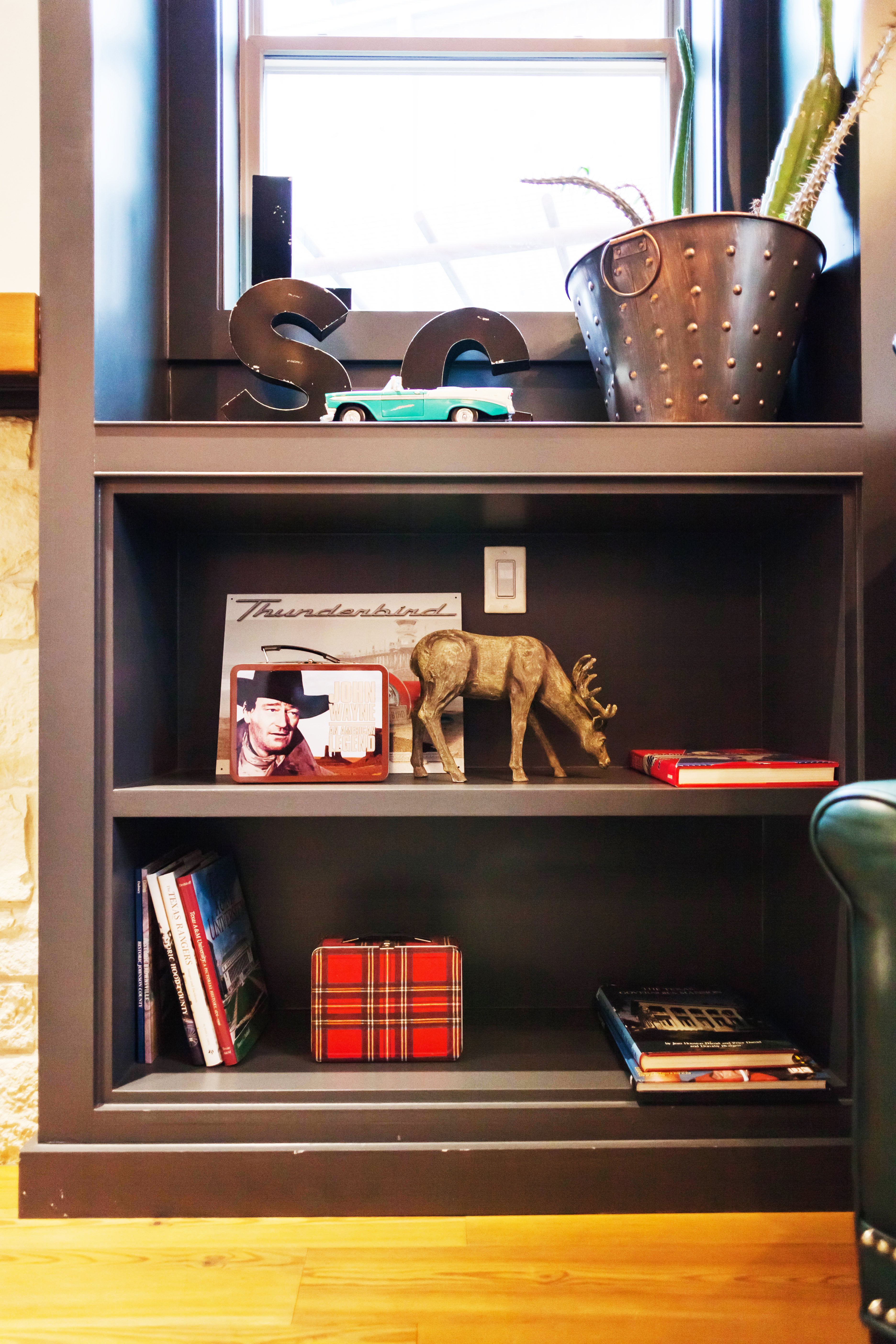
 The lobby was warm and inviting, decked in leather and hides, with western memorabilia displayed on the mantle and shelves. A turntable played old school country records which felt very “Welcome to Texas”.
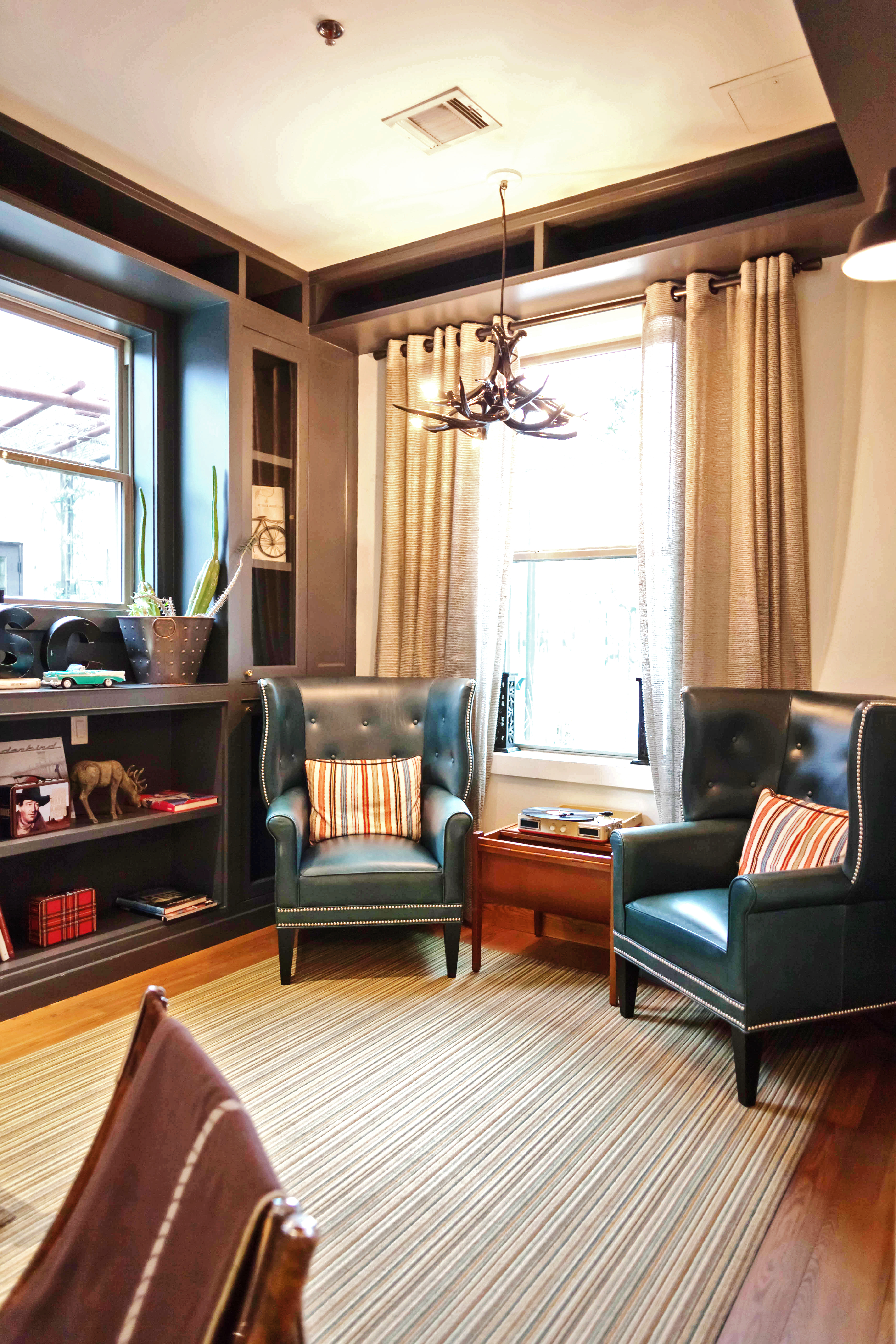
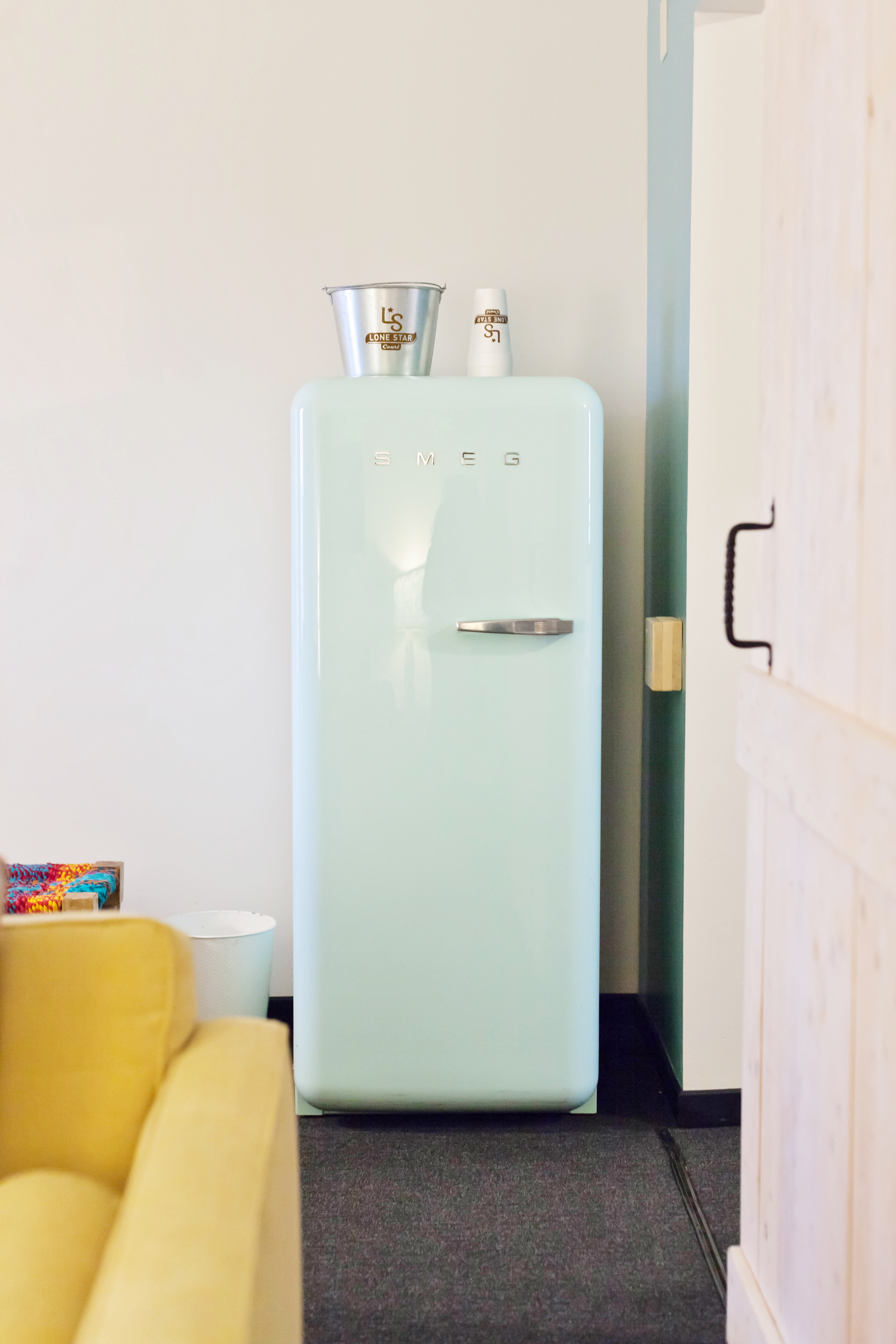
 This room seemed like a great place to hang out on such a dreary overcast day but I couldn’t wait to make it to my room.
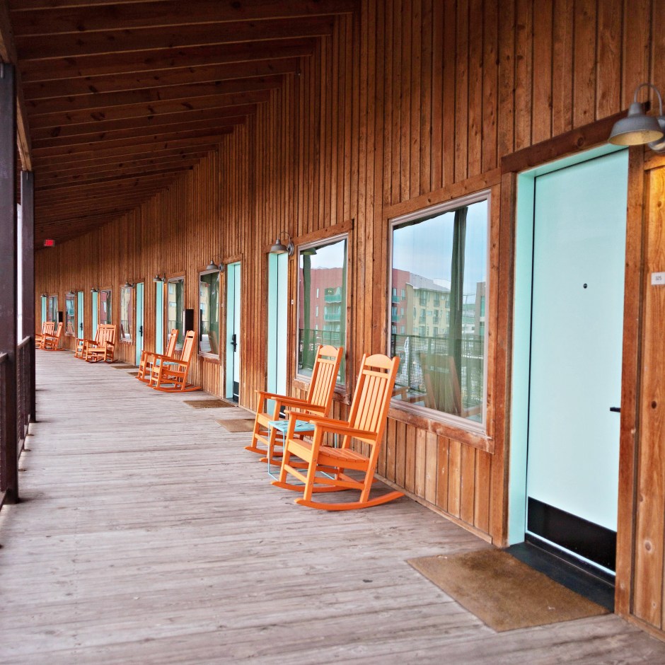
 The pathways are lined with orange rockers and aqua doors, one of my favorite retro color combinations everrrr. This sight made me so happy!
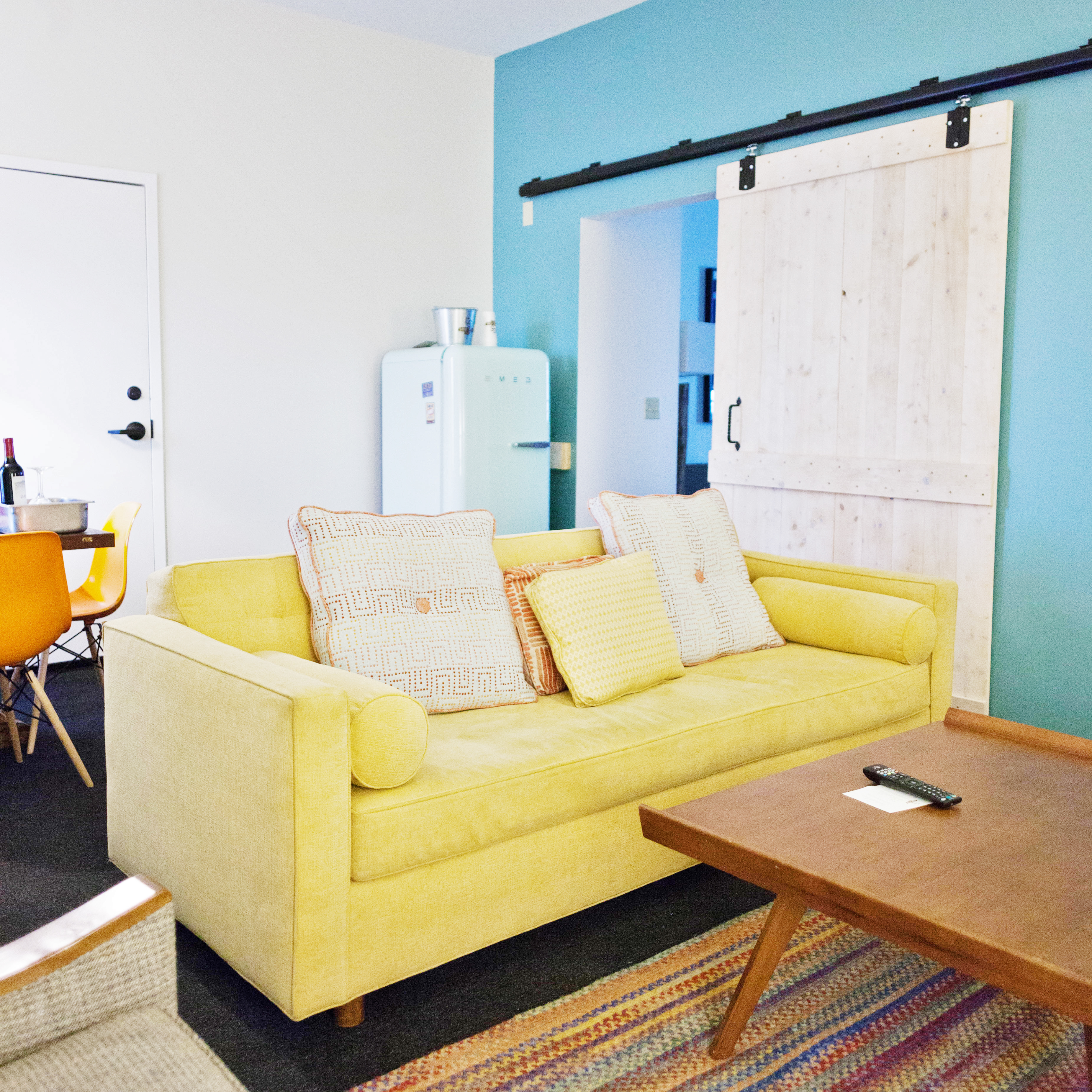
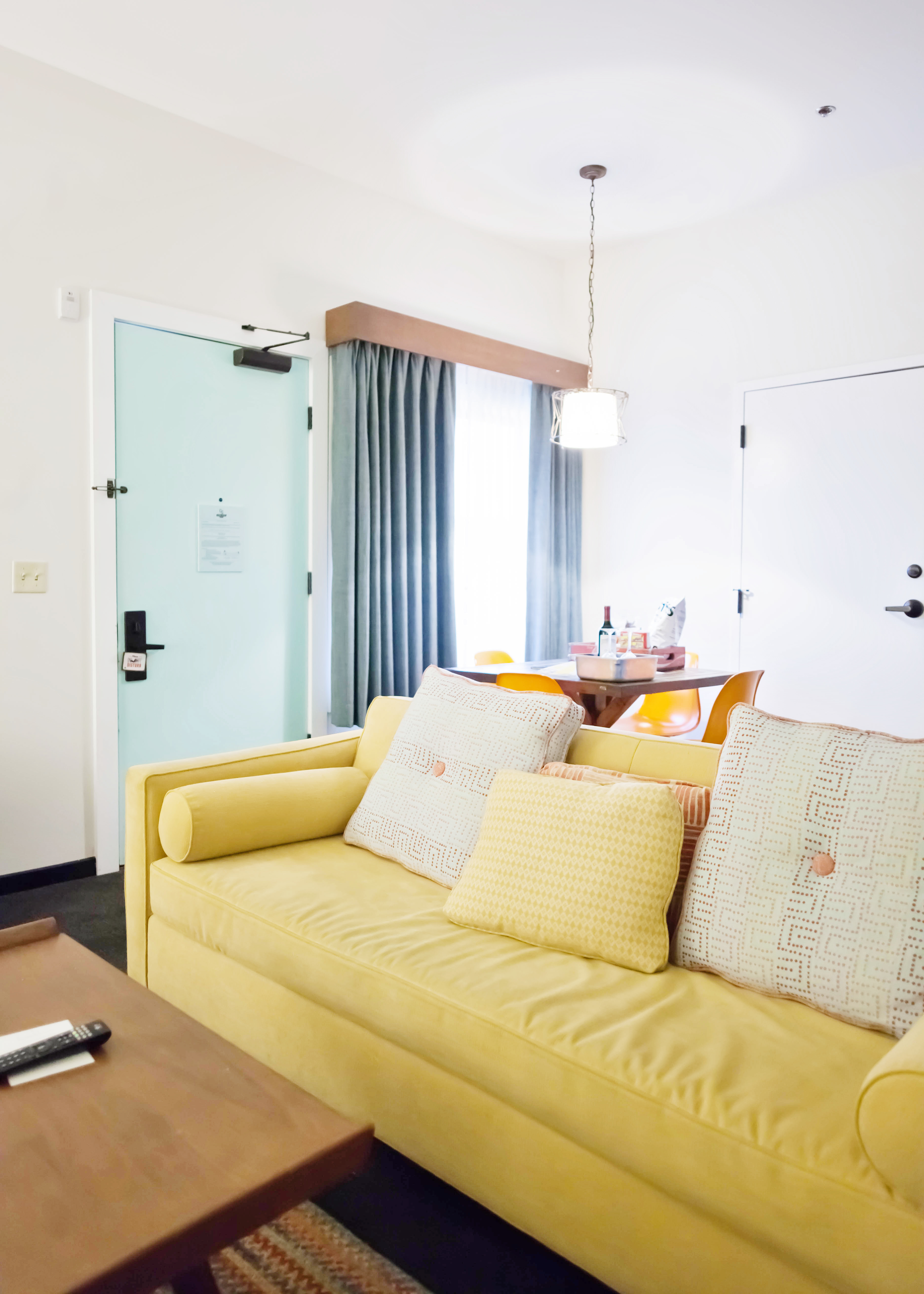 There was also a little dining table surrounded by Eames style molded plastic chairs that was covered in fairly priced mini bar snacks. The good stuff even!
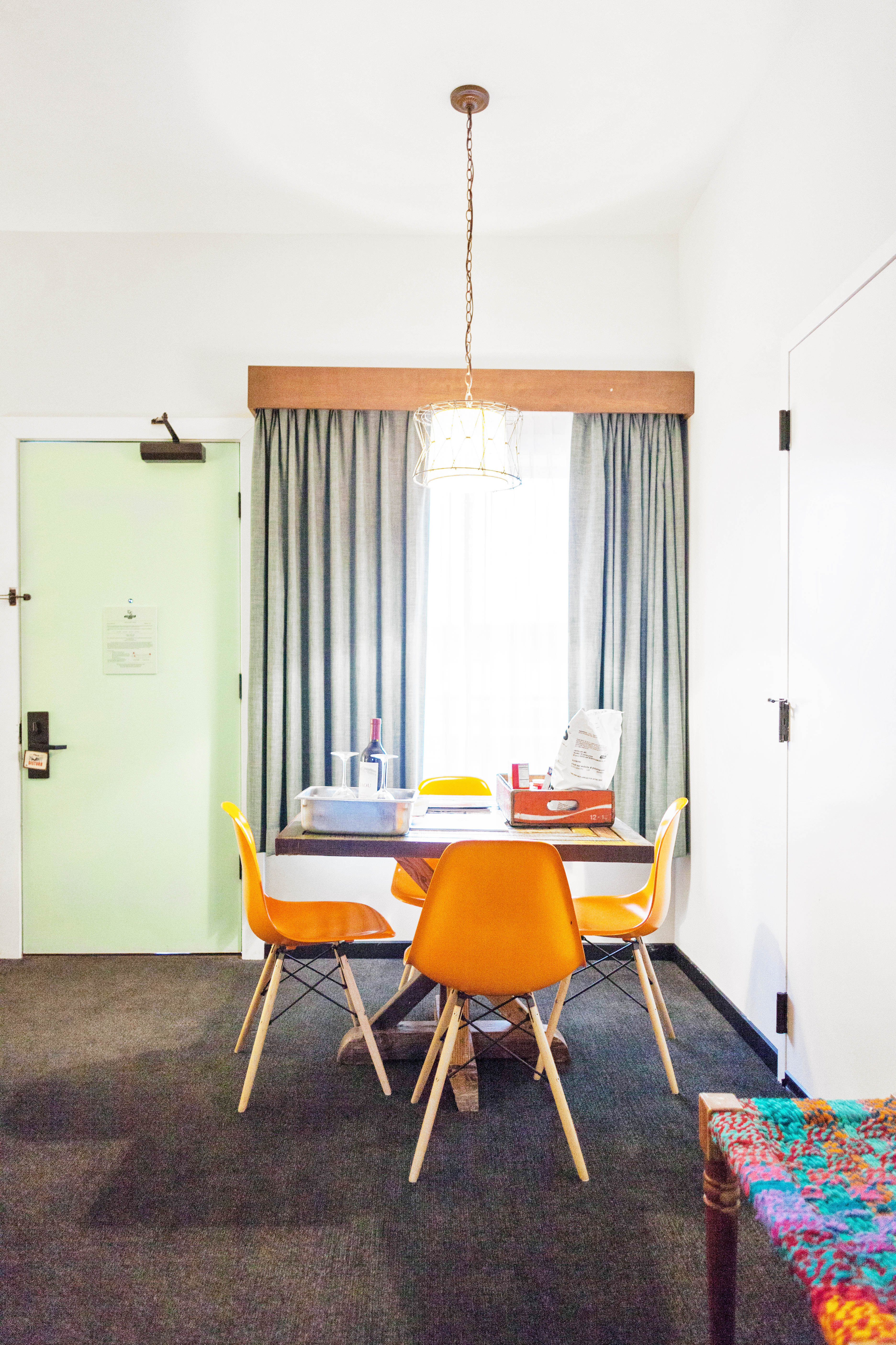
 My favorite part about this room was probably the bathroom though. You’ll see why.
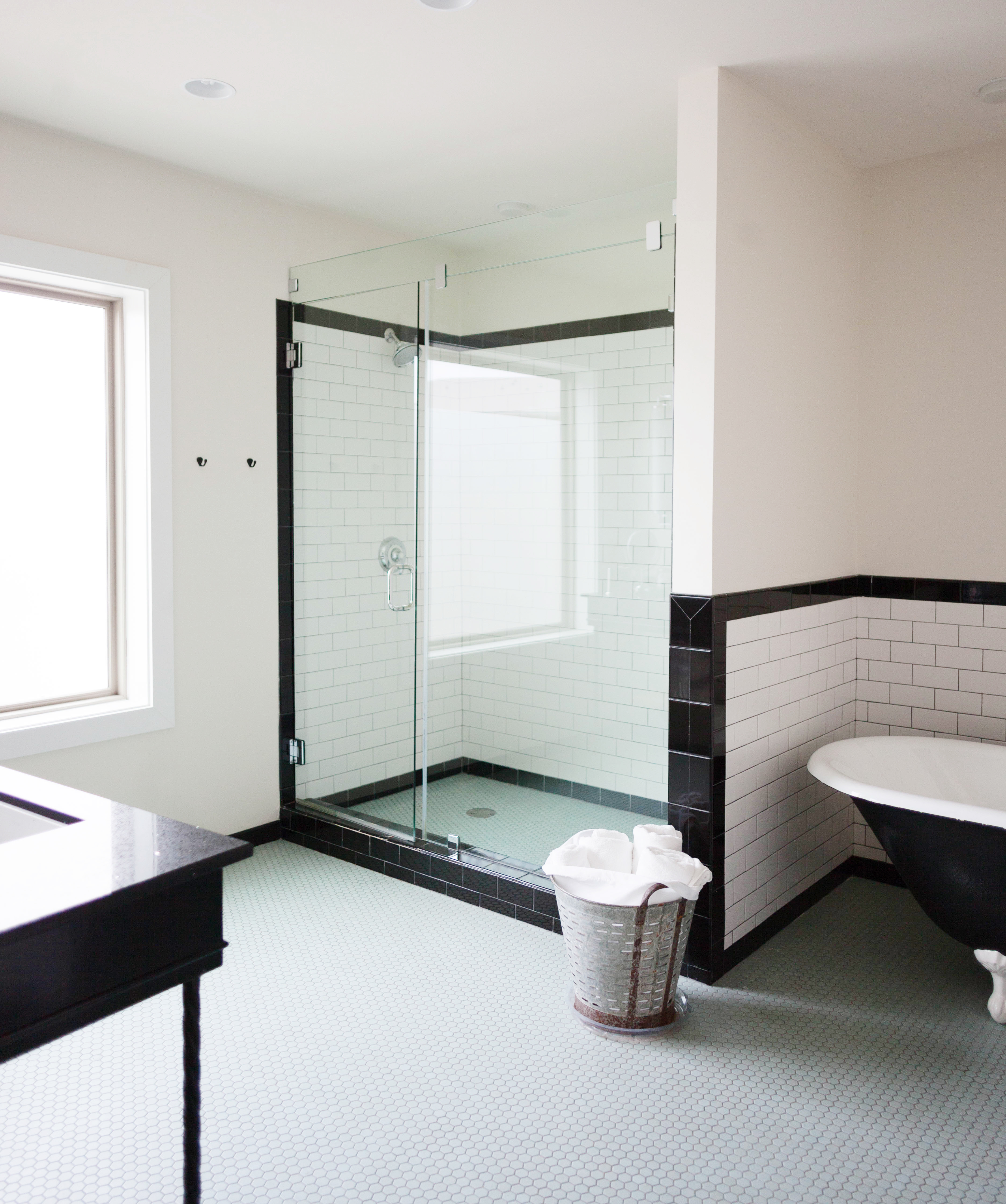 This shower and claw foot tub saved my lifeeee! It was just the thing I needed after a 9 hour drive.
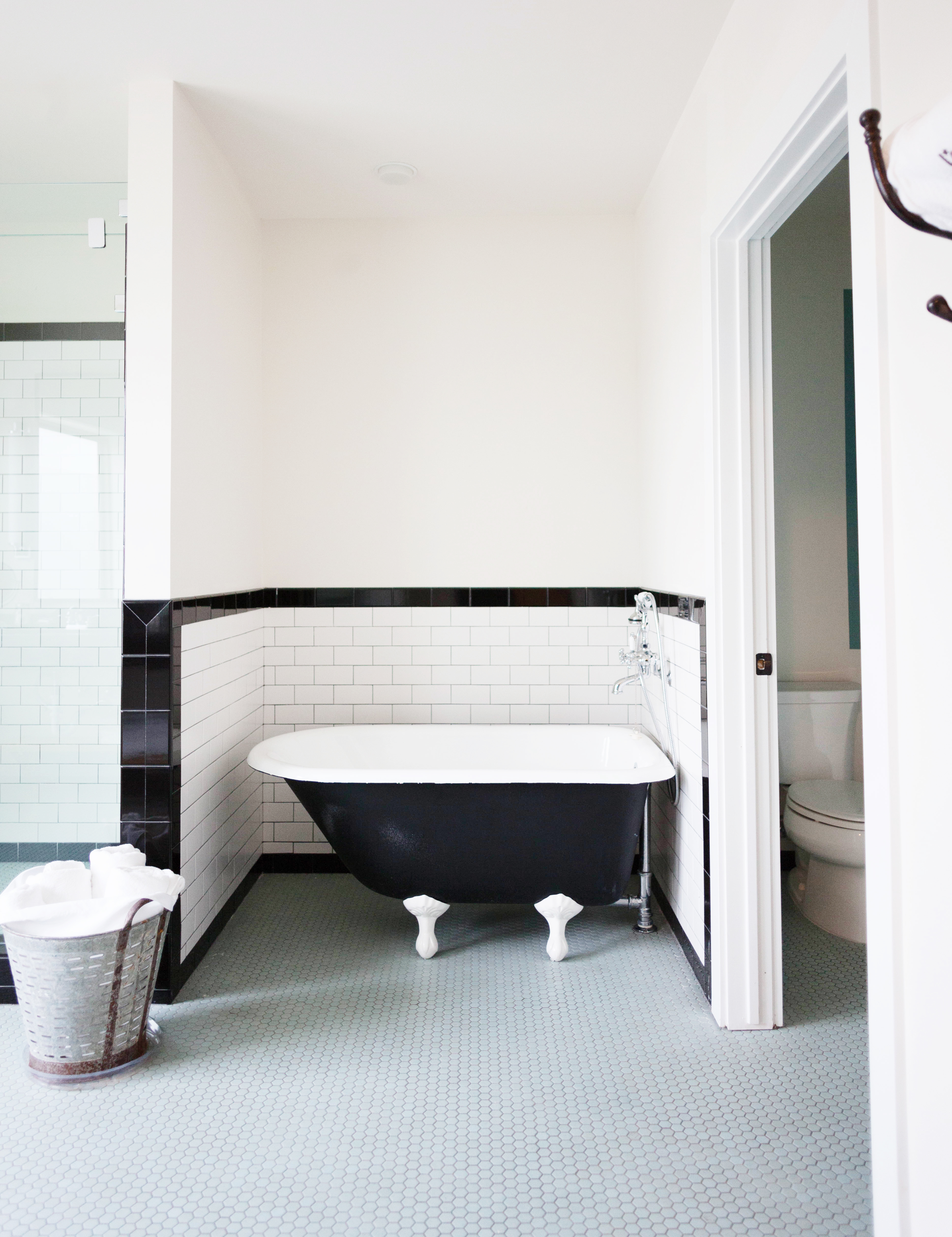 Plus how pretty is it?! I love the penny tile floor and black and white color scheme.
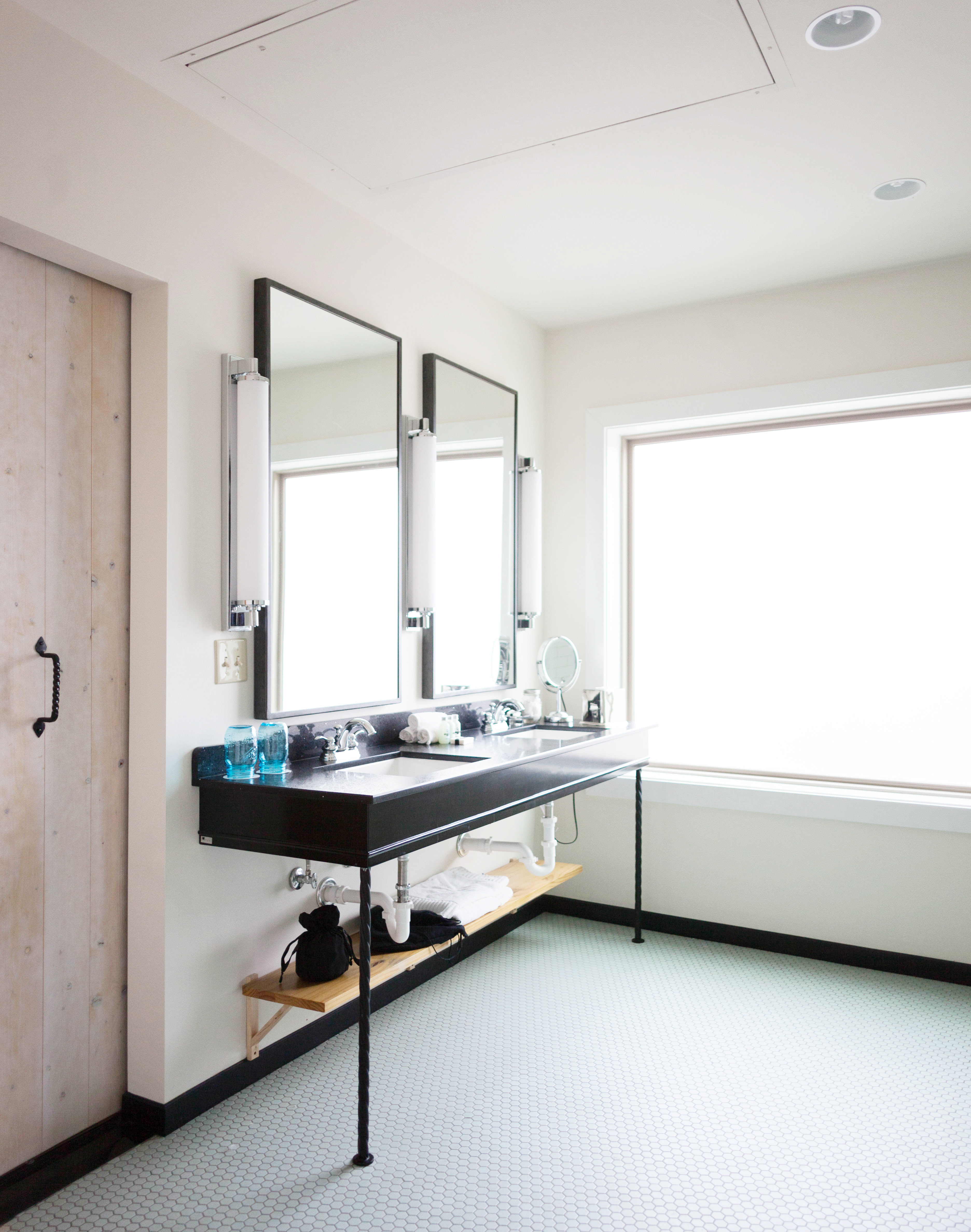
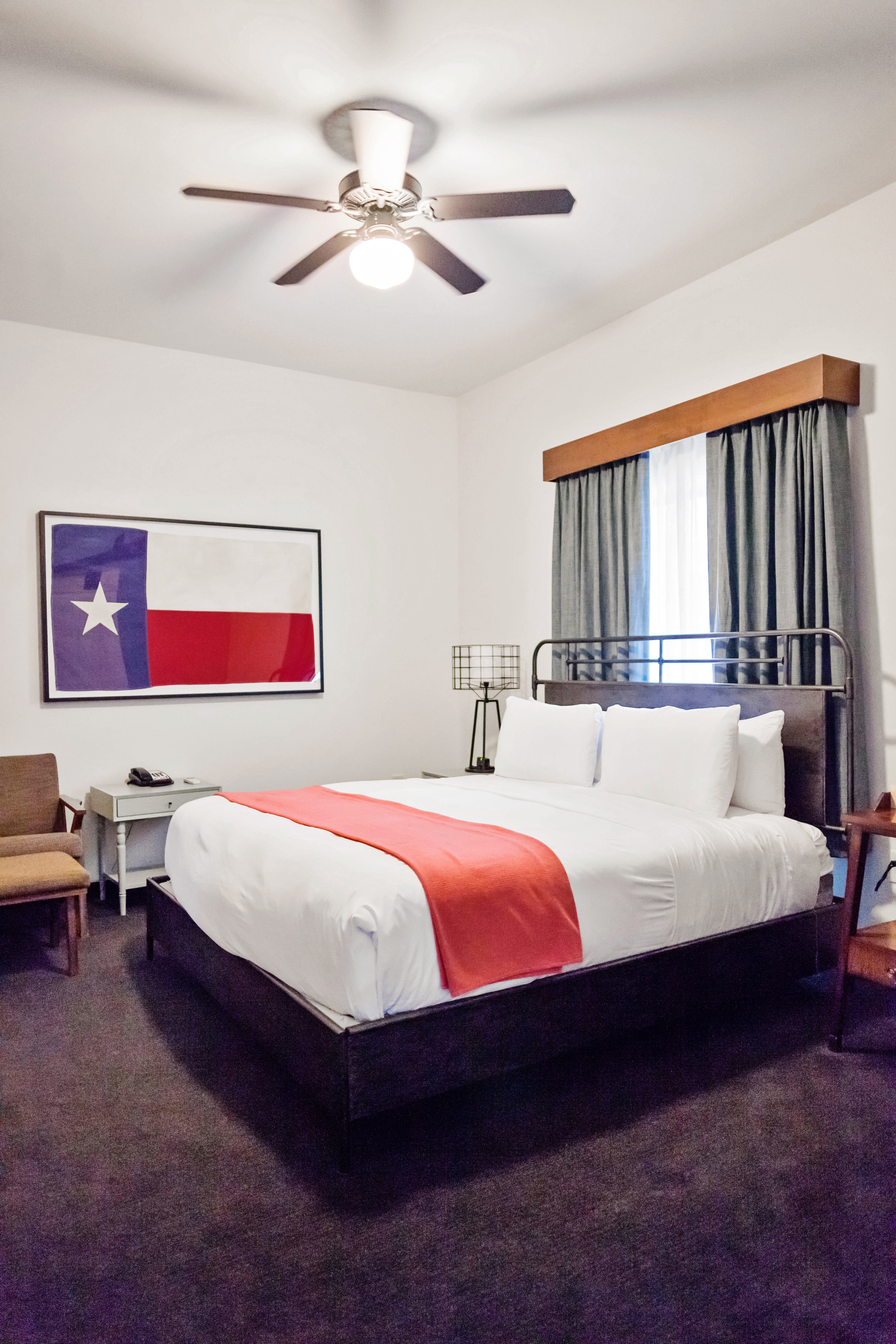 Clean, crisp, white sheets and a fluffy mattress! This bed felt like heaven!
 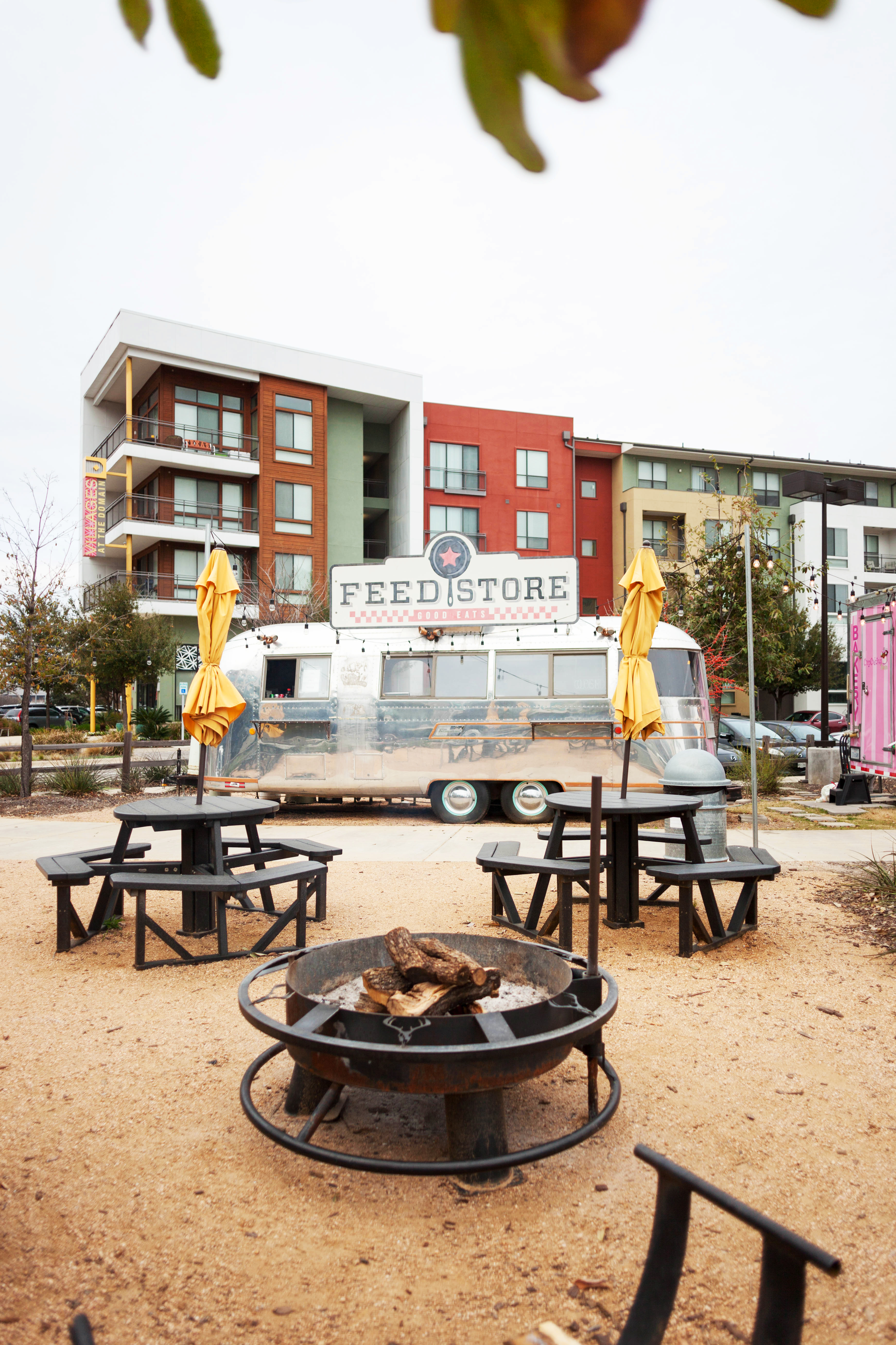 The grounds of the hotel have a few places to eat-
 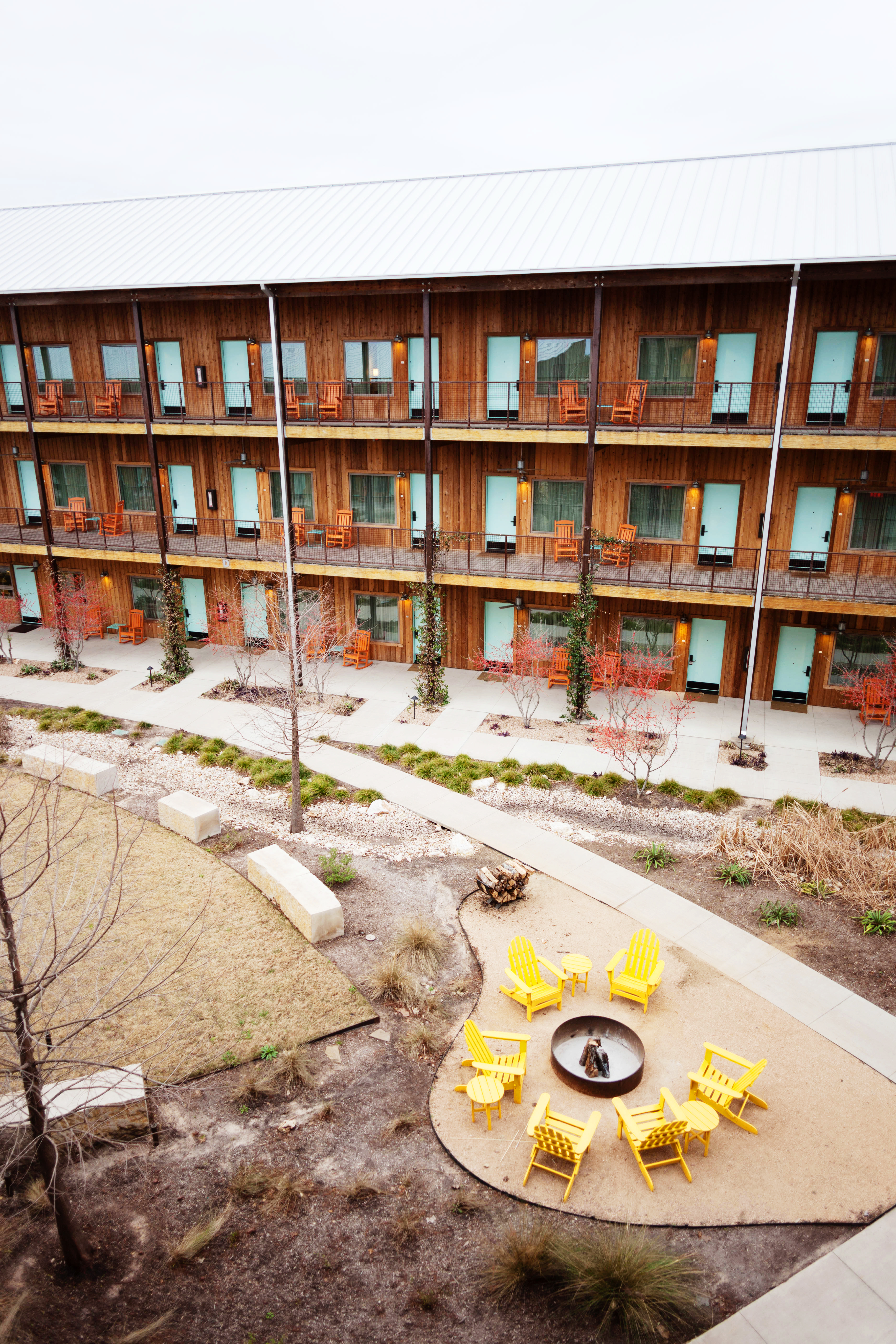 The grounds also have a ton of places to hang out around firepits and a pool.
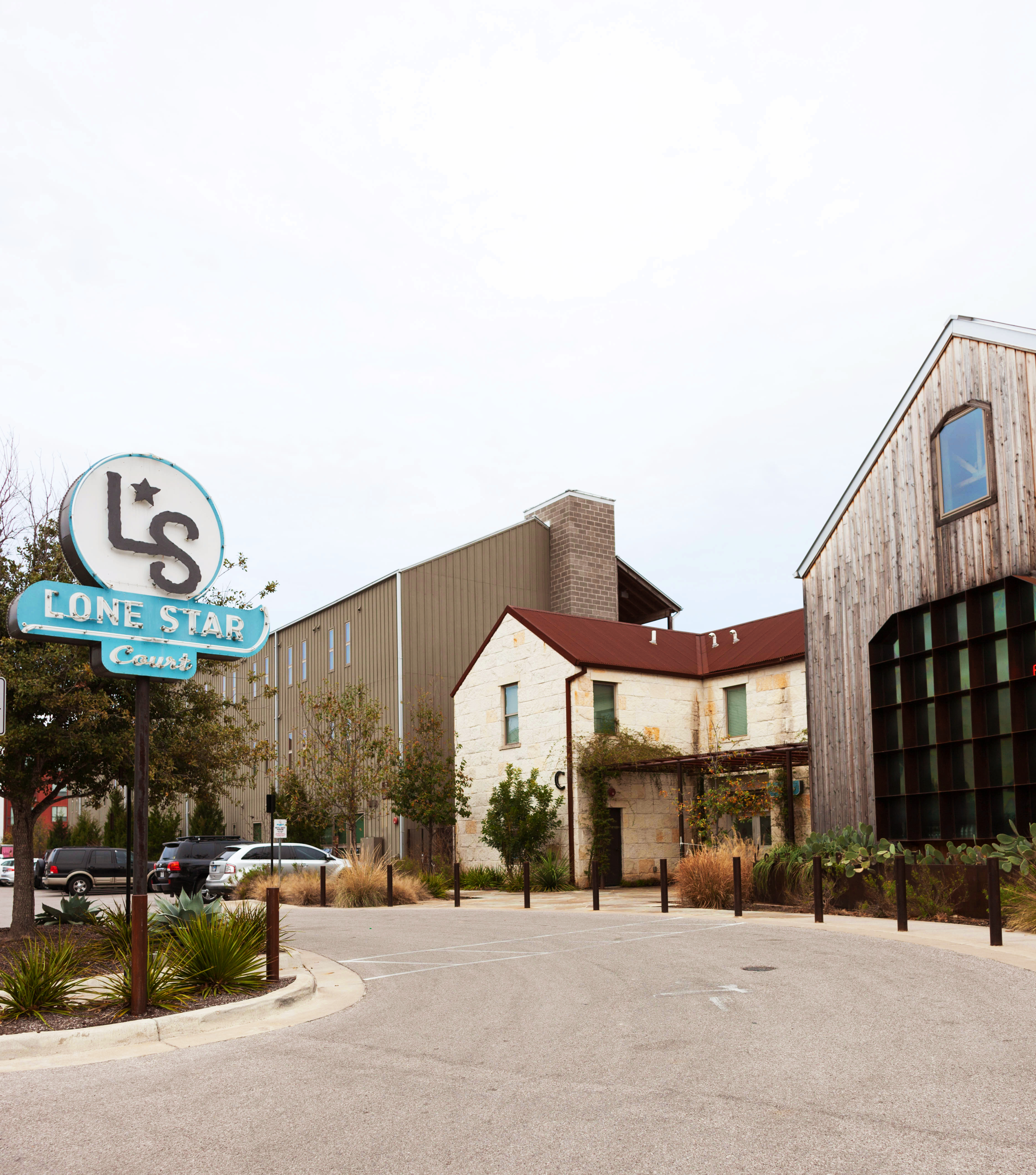
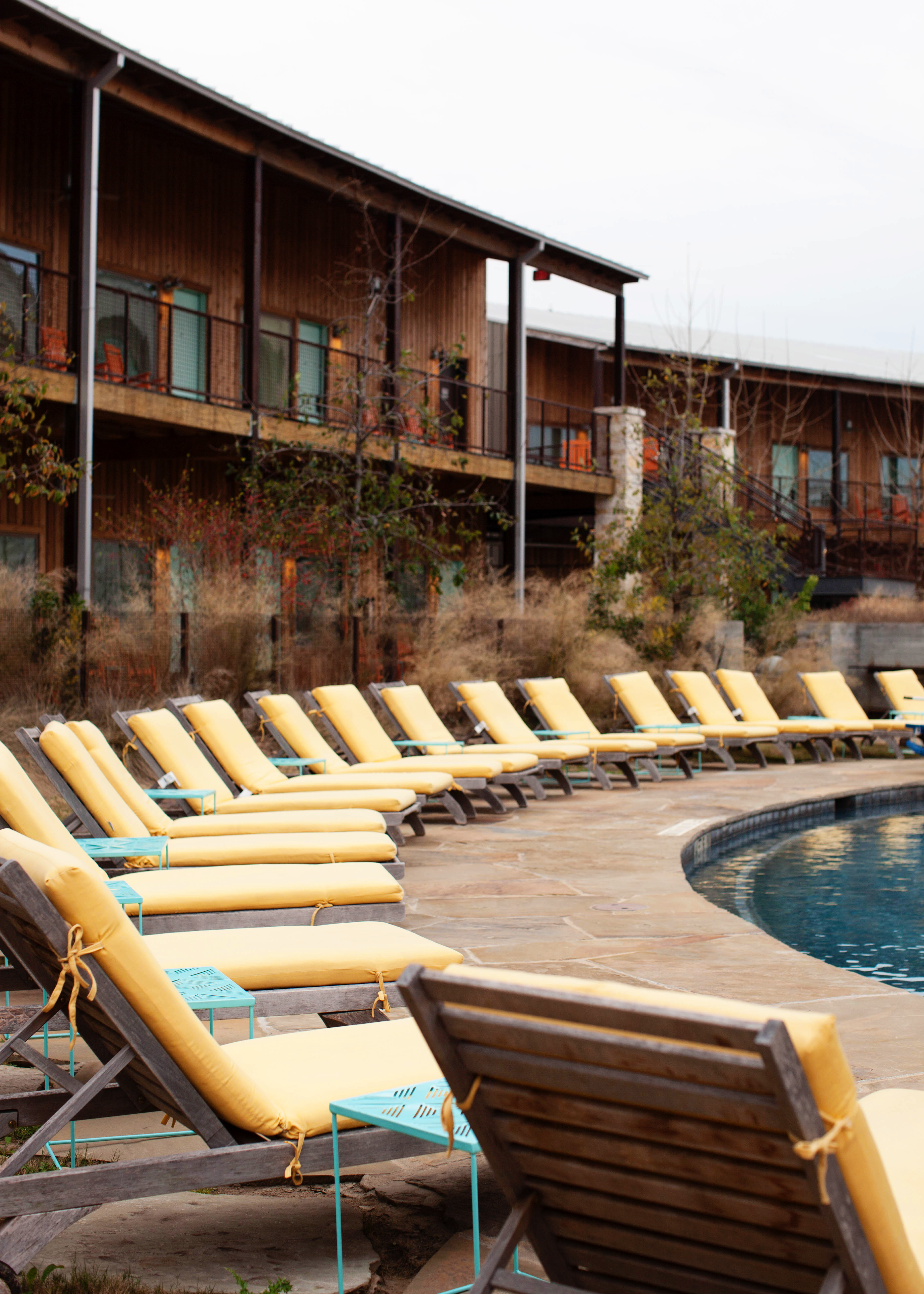 Lone Star Court is conveniently located next to a mall and lots of shops and restaurants, but when you’re in the court you kind of feel like you’re in their little world. One where you can relax in rocking chairs and drink a cocktail out of a mason jar while listening to the sounds of country western.
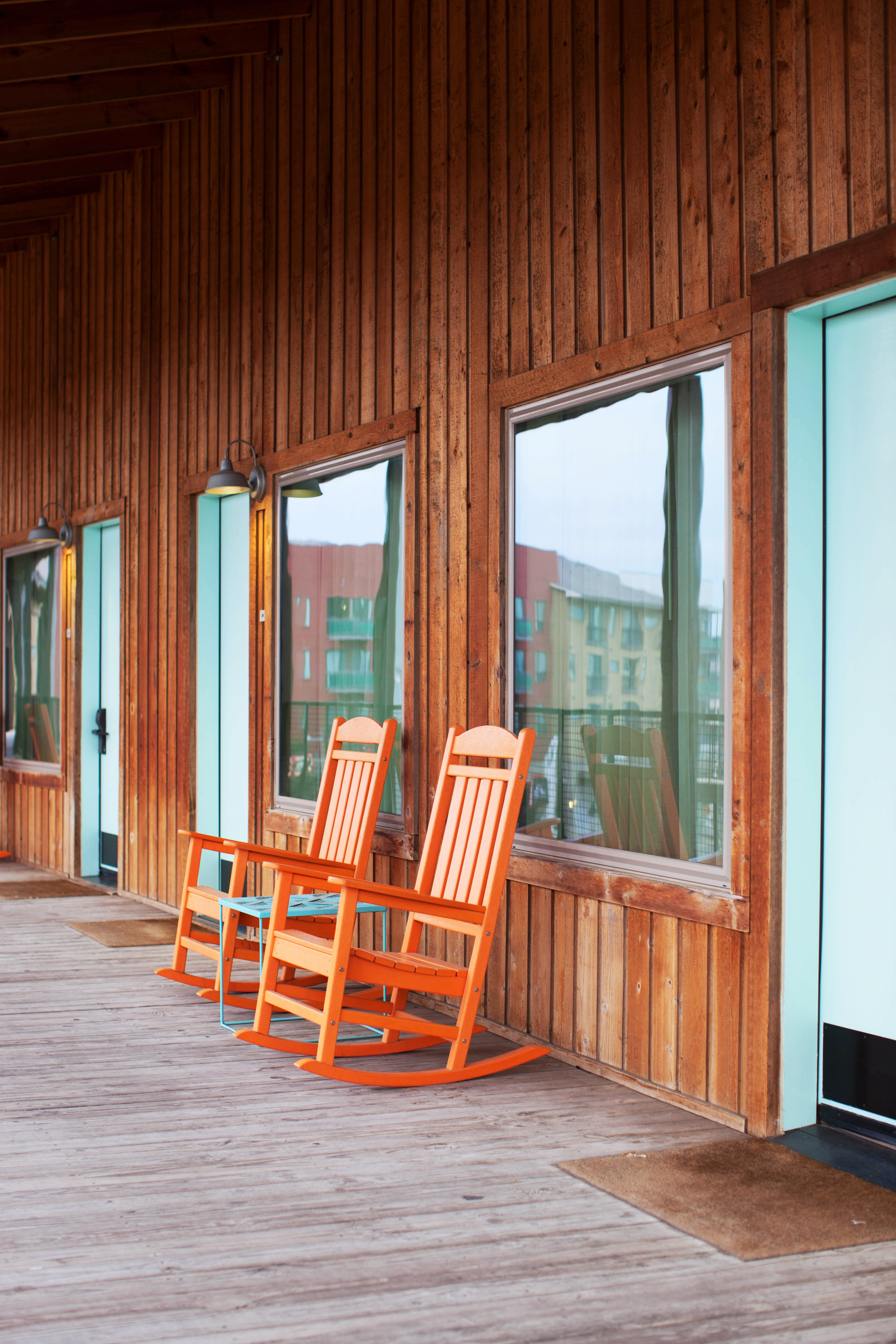 If you want retro vibes with tons of modern conveniences, check out Lone Star Court during your next visit to Austin.